At first blush, not much has changed about how men shave since the electric razor. But one company is shaking things up: A web-based startup called Harry’s has branded itself as a simple, superior and more affordable solution for shaving — and is vying against giants like Gillette and Schick for a $2.4 billion market in the process.
Sounds like a moonshot, except for the fact that Harry’s has raised $136.5 million from the tech venture community. On top of that, one of its co-founders is Jeffrey Raider, who played the same role at Warby Parker and has experience cracking markets with cool branding.
Today, that branding sits in the hands of Design Director Garrett Morin and Director of Digital Products Matthew Tully. Together, they have made telling compelling stories central to Harry’s value and identity. And they have a formula for how other consumer product companies can leverage the web and story to do the same. They spilled their secrets at First Round’s recent Design+Startup event in New York.
Why Sell with Storytelling
Well, first of all, why shaving?
Most of Harry’s staff has been asked this more than once. And the answer is a story: Co-founder Andy Katz-Mayfield went to pick up a razor at his local pharmacy and found himself shelling out too much for an uninspiring product and only a few extra blades. When he told his friend Jeff, they decided there had to be a better way to infuse shaving with an affordable, personable, and creative touch. These principles have since become a north star for the company.
Even a plotline as simple as that packs power when it comes to selling goods, Morin and Tully say. When your goal is to sell an experience, story has to be central to your strategy. This tactic has allowed them to accomplish 3 things critical to any brand’s success:
1) Turn customers into advocates.
“We want to give our customers all the tools and information they need to go on and talk about Harry’s in their own voice,” says Tully. “If we can package the experience, the mood, the feeling that we want our product to create and put it into customers' hands, then they go out into the world as megaphones for our message.”
When the company debuted a line of limited edition razor handles, Tully and Morin ventured to upstate New York to film a vignette of a man spending a weekend alone on a lake. “We wanted to capture the moment to describe how the product makes you feel.” Presenting an image so different from consumers’ daily lives made it memorable. What’s memorable becomes a conversation piece.
.jpg)
2) Stay part of the conversation.
Last year, Harry’s launched National Shave Day on December 1 to much fanfare — riding on the coattails of another cultural facial hair phenomena: Movember. In doing so, they appealed their target market, and not only appeared timely, but prescient. After not shaving all month, men everywhere were in desperate need of a good razor.
“The holiday created more story around the brand. We had an event at our barber shop, put it on the web, promoted it on social media, and we watched the conversions explode,” says Morin. “When we tell stories that connect with people, it’s obvious. On National Shave Day we saw a 360% lift in traffic to the website.
3) Emphasize expertise.
Harry’s took two actions that boosted their credibility as shaving savants: They opened their own corner barber shop in Manhattan, and they invested a whopping $100 million to buy their own razor factory in Germany (a noted home of fine craftsmanship). While these were concrete actions, the branding around them made the difference. Both have a lot of real estate on the company’s website and social media — complete with profiles of their barbers and gritty video directly from the factory floor. No models. No posturing.
“Promoting the fact that we are now vertically integrated with our blades had an amazing side effect,” says Tully. “When we put the story about the factory out there, it jumpstarted this feedback loop with our customers that we put right back into production. Now we can tell an even better story that we’re always improving and our customers are a part of that.”
When it comes to the nuts and bolts of putting these stories together, Morin and Tully rely on a tried-and-true formula that has helped them blow out each of the stories mentioned above — drawing in thousands of new customers and fans. It goes something like this:
- BUILD YOUR STORY
- DESIGN YOUR PRODUCT
- SKETCH YOUR EXECUTION
- DELIVER ON INSPIRATION
Each step builds on the one before it to create a branding language that remains consistent across product and promotions. This is how the company communicates one end-to-end experience: If you use our product, this is how you will feel.
Story Building
As the first step in the branding process, this is also the messiest. And perhaps the most fun.
“Our goal is to establish a mood as quickly as possible,” says Tully. “We move fast to collect everything we can find that fits the look and feel we’re going for. Go out and find textures, colors, photos, movies, music that embodies the feeling you are trying to create.”
Some of these inspirations will be abstract — a color swatch, a song that came on while you were hanging out with friends in the back yard. Others will be super literal: “This photo is how our campaign should look almost exactly.” You want to grab it all within a bounded period of time, and put it together to note the commonalities, the contrasts, the overtones.
Designers often refer to these collages as “mood boards,” but as Morin says, “The great thing about this part of the process is that it’s communicative to non-designers.”
We constantly remind ourselves that we're not just a brand, we're a whole company.
This means working with and fielding input from a lot of people who think differently — from the barbers at the corner store to engineers to finance. “We need to be able to approach all of these people with something we can easily explain, that will make it clear what we're trying to accomplish and why,” says Morin. “When we have all of this imagery to show, we can say things like ‘70s surfer culture’ or ‘East Coast beaches’ and people will get it right away. Naming and vocalizing these inspirations is part of the process.”
For this year's Spring/Summer collection, the team at Harry’s found itself knee deep in eye-popping orange and turquoise influences layered over photos of Palm Springs architecture. Then Morin presented a snippet of a film showcasing a home by Italian designer and architect Ettore Sottsass. “The geometry was beautiful, the mood was quiet. We immediately knew that’s what we were going for,” he says.
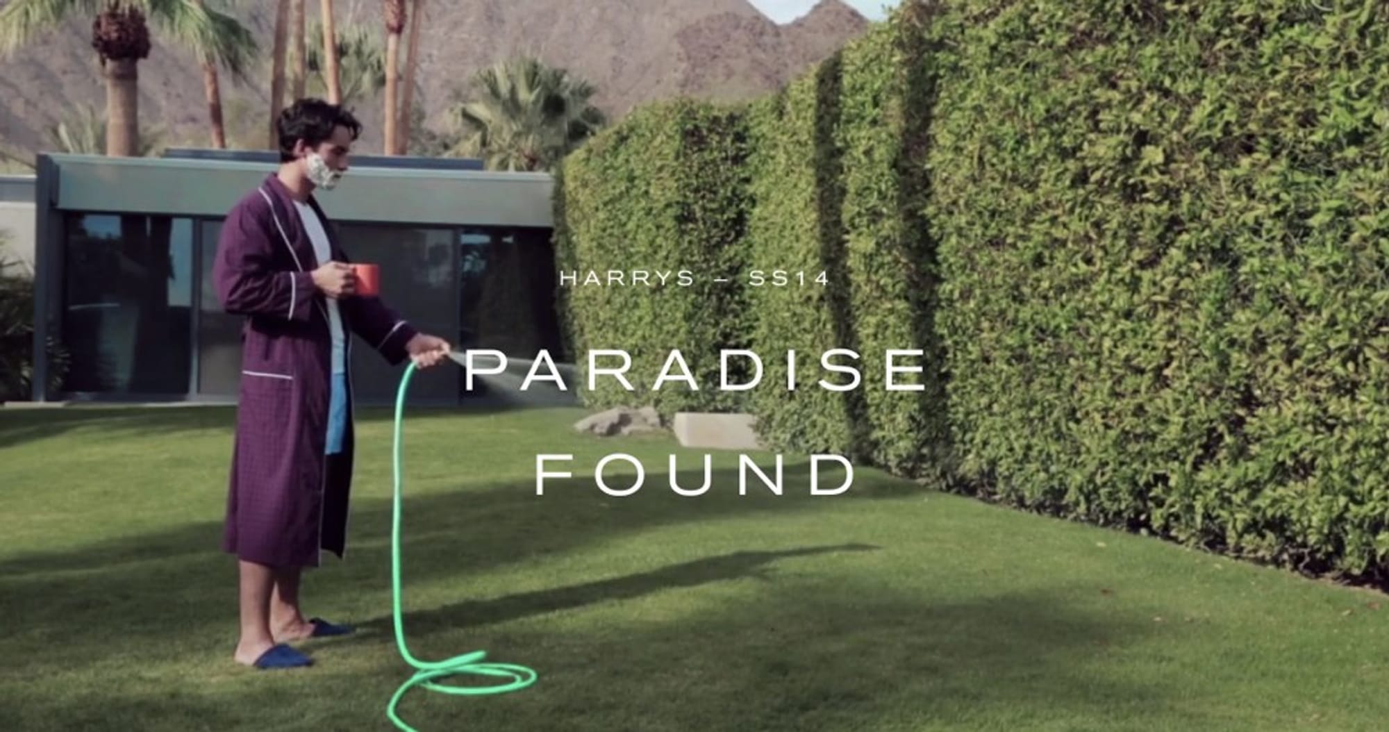
All of this culminated in one campaign: Paradise Found. It’s an image of a fairly normal looking guy, shaving cream on his cheeks, coffee cup in one hand, watering his lawn with a bungalow and Palm Springs’ signature mountains rising in the background. “It’s the picture of a weekend. A guy. He doesn’t have a super model girlfriend. He doesn’t want a diamond-plated bathroom. He just wants a good shave,” says Morin. When it all comes together, it’s not just a series of photos or videos, it’s an experience crafted to connect with customers.
Product Design
When you look at the consumer companies that have successfully taken on major competitors by projecting a new type of “cool” — like Warby Parker, or TOM’s Shoes, or Patagonia — it’s clear that branding extends into and shapes the products themselves. Harry’s has taken this to a new level, styling its razors to reflect the same colors, textures, and materials that define its promotions.

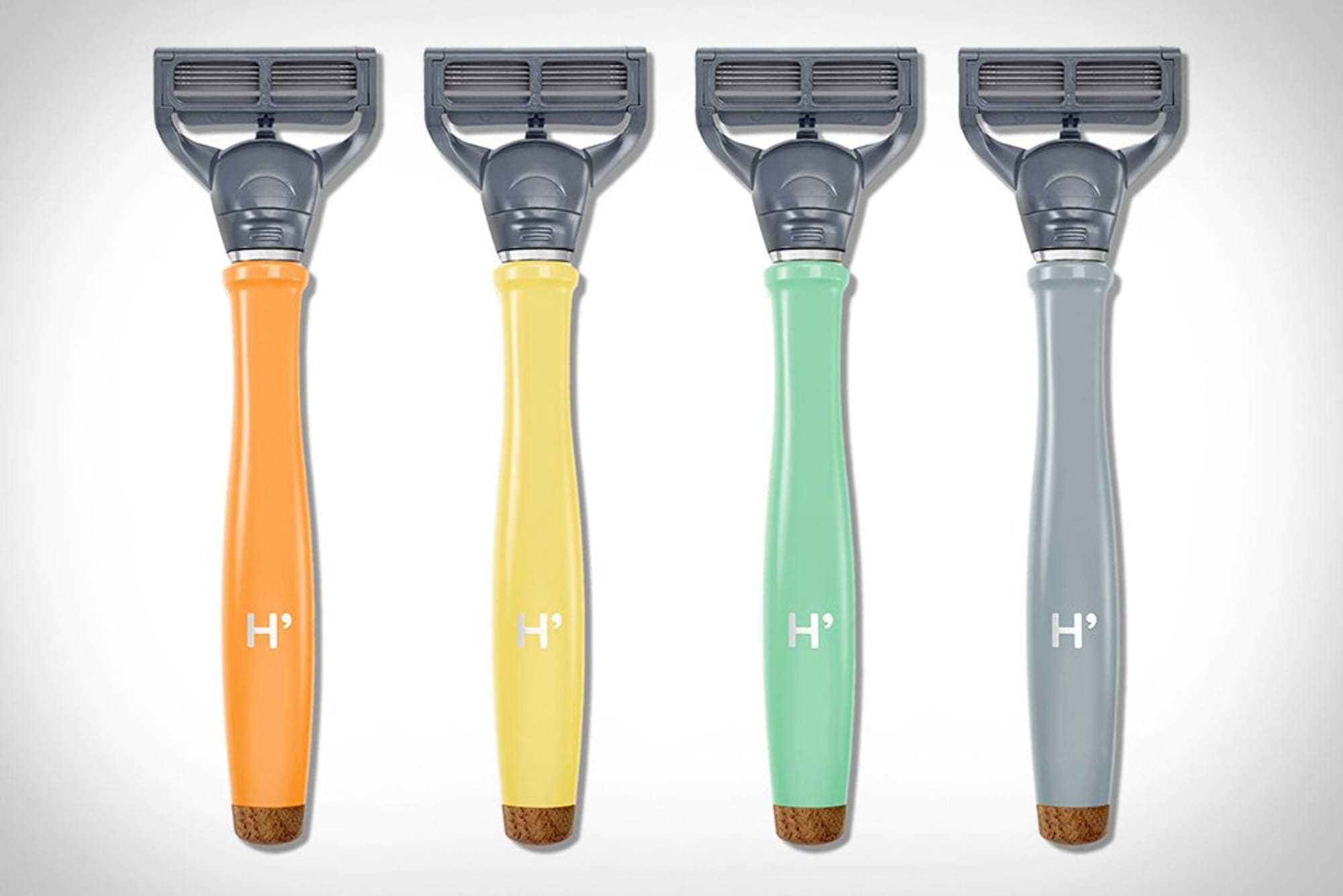
“When we started designing the handle for our Spring/Summer line, we mined through all the different color samples we collected, and we landed on a few shades,” says Morin. Notably, if you hold the four different handles up to the photo above, you can see that one captures the color of the garden hose, another the coffee cup, another the earthy gray of the building in the backdrop. It’s nearly seamless.

But Morin and Tully didn’t stop there. “The question was whether these unique colors were enough to move a customer from our website to getting a razor into their bathroom — are we doing enough to communicate a chill stay-cation in Palm Springs?”
Looking back at their mood boards, and the film clip, they noted how much wood texture kept popping up. It represented a masculinity and gravitas that was missing from the gem-tone razors they had produced, and they knew they had to include it.
“It actually took a tremendous amount of work putting the product through hell to get the wood on the bottom of this plastic razor,” says Morin. “But when you’re telling a story, especially in the context of the web, you need to frame your products the same way.”
You want to push the product as far as you can. Take chances to get it right.
Napkin Sketches
“Napkin sketches are quick, their disposable, they’re arguably the best tool for getting ideas out of your head and onto paper so you can see if they're going to work or not,” Morin says.
Moving back from the product to the promotions surrounding it, Harry’s branding team says that almost all of their marketing collateral — particularly photo and video shoots — are guided by rough sketches up until they arrive on set.
“There’s a misconception that photographers don’t want too much direction, but the reality is you need something to get you moving,” says Morin. “Napkin sketches are a great way to say hey, let’s tackle this shot first, and then you can see where inspiration takes you.”
The best thing about this tactic: High ROI.
“Sketches are surprisingly effective,” Tully says. “They take a couple seconds to create but save you so much time, money, and resources — and the nudge to start executing. If it’s photography, or film, animation or digital design, you want something that will get you close, but not all the way there.”
You want to plan upfront, but have the freedom to do something completely different.
Elaborate storyboarding and scripts lock you into something specific, even if it’s clearly not the right direction when you actually see it in person.
“It’s all about visualizing your execution,” says Tully. “If you sketch things out quick and rough, the faster you’ll be able to kill bad ideas without feeling like you’re killing sacred cows. It’s easy to move away from things and fold in criticism before anything is fully baked. More often than not, these quick blueprints roll into what you deliver in the end.”
Strategic Delivery
Once you have all the assets you need for a campaign or to tell a particular story, you need to be careful about how you use them. Planning their release requires just as much effort and craftsmanship as their creation.
“As someone who has been immersed in all of these images and stories, it’s easy to forget that your customer hasn’t seen anything yet,” says Morin. “How you share them with your audience will determine how effective they ultimately are.”
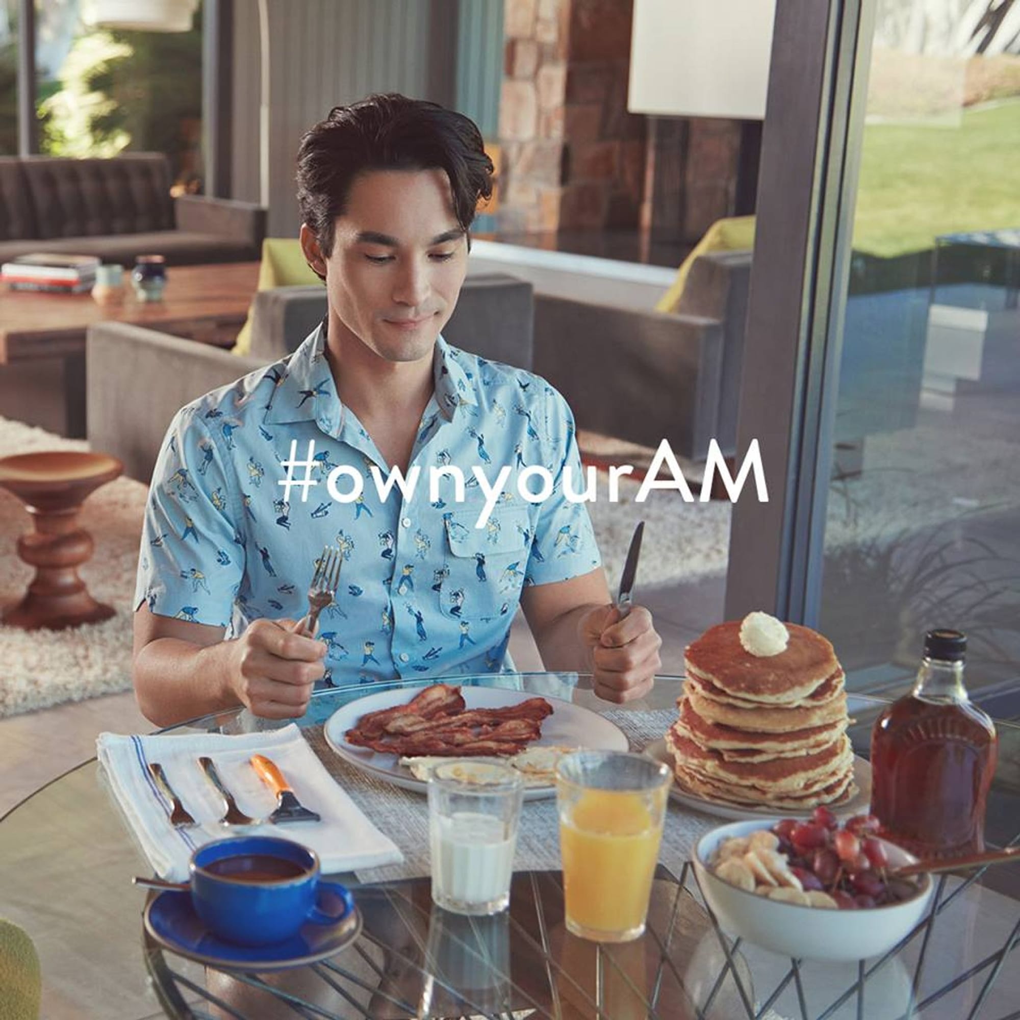
For the Spring/Summer line, the Paradise Found image became the anchor of a look book showcasing the lifestyle and ambiance projected by the razor handles themselves. The book is designed to be circulated to media outlets along with the new handles. In addition, they created numerous photos, quick videos ripe for social sharing, and language to tie it all together. One example is the #ownyourAM hashtag on both Twitter and Facebook, also devised to make the image of the peaceful, paradisiacal morning stick in customers’ minds.

The other key is to make sure your content doesn’t get in the way of your higher objective: making sales, Tully emphasizes.
“We’re trying to get people to want our razors to be a part of their lives, so the goal is to release the content at the same even, steady pace — not all before or during the product release,” Morin says. “Jamming together all this content we’re really proud of would defeat the end purpose. The key is to use it in creative ways.”
The stories you tell need to supplement the shopping and purchase experience.
In practice, this means placing most of your assets outside of your site: on social media, advertising, in traditional media hits, out in the real world where people will encounter them organically. Maximizing visibility is key, Tully says. And when it comes to startups, visibility is all about share-ability. That’s why brands like Harry’s place so much emphasis on photos, because they are the most-shared content across channels.
“The more people you can reach with your content, the more who will relate to the experience you’re creating, the more people who will make a purchase and talk about it to their friends,” he says. “When they land on our site, we don’t want to waste their time. Convenience is part of the story we’re telling.”
This doesn’t mean that Harry’s doesn’t do any storytelling on its website. An entire section is devoted to the story points that best define the image they are trying to convey: the corner shop, the factory, the origin story that places them neatly in the category of normal, hard working guys that value attainable quality. The way this information is nested within the site lets users dig deeper into the Harry’s brand if they want to, or simply get in and get out with the product they want.
“If you like our brand, you’ll buy the turquoise-wood handle. If you love our brand, you’ll watch the guy water the lawn, look at more photos, connect with what we’re creating,” says Morin.
Our goal is to have you show up liking us and leave the website loving us.
Whether or not this happens depends on how invested users and customers become in the Harry’s story, he says. Everything you do around brand should make that investment as easy and effortless as all your branding looks.
