Kamo Asatryan may very well be one of the best kept secrets in the startup ecosystem. He’s one of a small handful of people who have observed hundreds of mobile apps, thought deeply and scientifically about their mechanics, and determined what they could change to grow faster.
To demonstrate his particular brand of magic: Asatryan’s team recently worked with an app that required users to swipe through four screens explaining the product in-depth before they could sign up. Then the permissions screen literally begged them to let the app access their location data. 60% said no and went on to a dead-end experience.
To turn things around, Asatryan tested a radically different approach: Assuming that users who installed the app already understood the need to provide their location data. This allowed them to axe out the long-winded welcome flow and make the permissions request the second screen. The text was changed to say that users needed to “Enable Location Permissions” (making it clear that it would be for their benefit), and they were literally not able to move on from the screen without saying yes. This sounds risky, but after the shift, 95% of users said yes and went on to a much better product experience.
As Co-founder and VP of Growth for Lolapps, Asatryan created a metrics-driven approach that landed the company over 110 million users. Now he’s bringing that expertise to his new company, Primer, focused entirely on improving new user experiences for native apps on mobile. Without a doubt, this is one of the most tactical pieces The Review has ever published. In this exclusive interview, Asatryan not only provides the formulas he relies on to help mobile apps optimize their entire user funnel, but the counterintuitive lessons and mistakes he’s learned on the job. Anyone who works on a mobile app in any capacity has something to gain from this clear-cut look at what drives true, meaningful growth.
A Checklist for High-Growth Mobile Apps
1. Don’t over-educate your users.
When it comes to onboarding, too many apps open for the first time to a series of sliding screens that do nothing more than look pretty and provide more reading about what the product does. Don’t do this. “The users who installed your app already took a set of high-friction actions to find it in the App Store, install it and open it after download,” says Asatryan. “They didn’t do all that just to learn more about your product. When you look at user tests, no one pauses to read this text. And the very few who do immediately forget what they read when they have to take an action like filling out a signup form.”
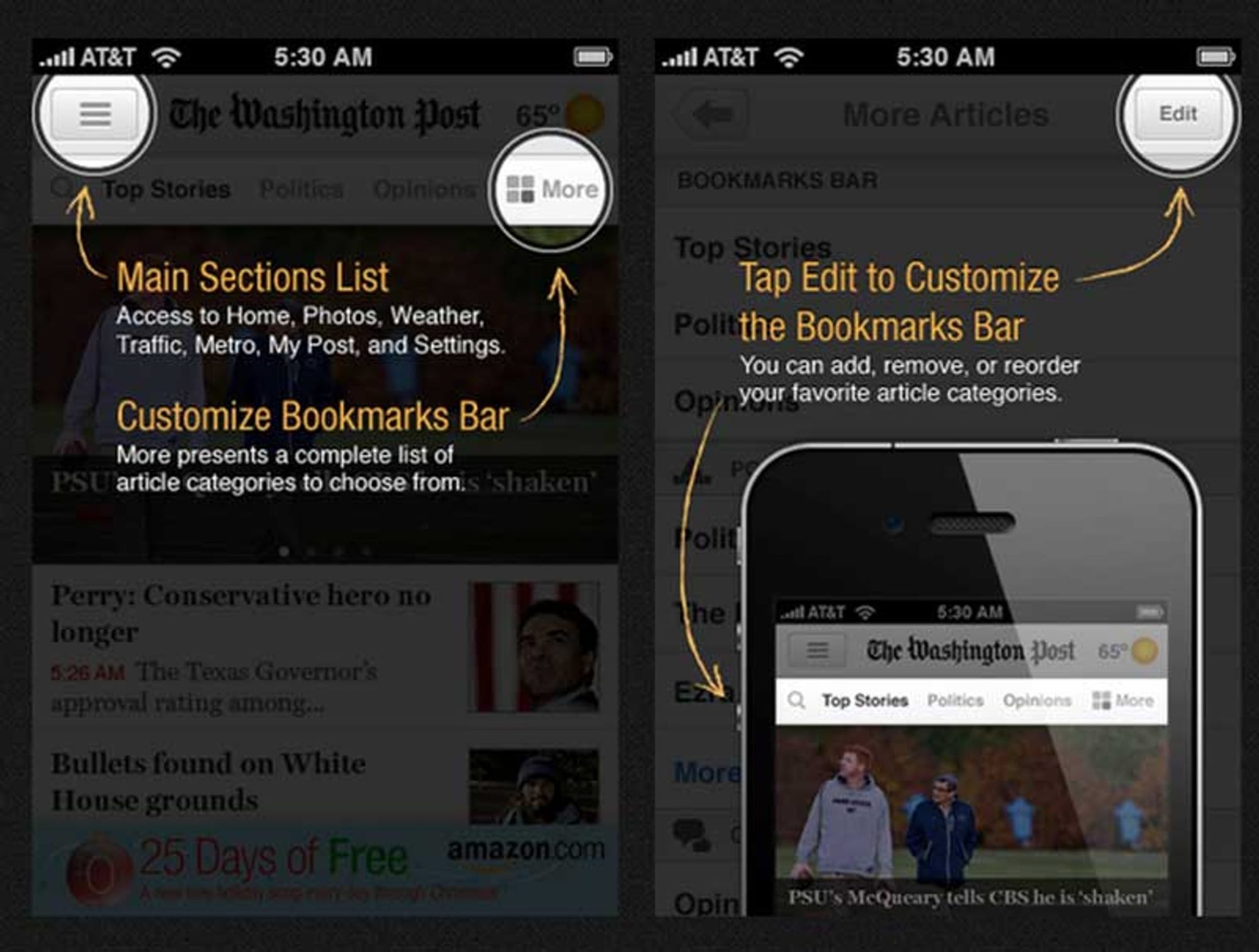
Instead, you want to replace these opening screens with “tool tips” layered on top of UI elements. That way users can learn about what to do in the app while also taking those actions in real time. Learning by doing is much more effective because the user gets the context about an action, takes the action and sees immediate feedback within the span of a few seconds. Think about how apps like Slack use some sort of flashing or eye-catching element to walk you through the basic functionality while also making you feel productive.
“Every time we’ve replaced traditional welcome screens with an in-line tutorial with tool tips, we’ve seen a 30% to 50% increase in conversion from install to user activation,” says Asatryan. “This is one of the easiest, highest-impact changes that you can implement right now.”
2. Bust unexpected sources of friction.
You want to remove all friction in your app’s new user experience before adding more options or catering to edge cases. “You have to make sure there is only one clear, dominating action on every screen of your app. Don’t present equal choices or the possibility of accidental taps on the wrong button. You can’t make assumptions that users will read any of the copy you provide. As a quick test, try covering up the copy with your hand and see if the primary action of the screen and its purpose are both still obvious,” Asatryan says.
Design every dominant call to action to move users forward consistently with all previous calls to action they chose beforehand. All of these CTAs should look and feel the same in terms of superficial traits like color, font, wording, placement. Don’t make your users suddenly reach for the upper right-hand corner of their iPhone 6+ screens when they’ve been tapping a large button at the bottom center the entire time. People’s eyes track the same way. Whenever you take them out of bounds or do something unexpected, you risk losing users.
A lot of app makers miss out on low-hanging fruit here. For example, if users are signing up and creating a password, don’t require both letters and numbers because, on mobile, a user will have to switch keyboards back and forth. “You have to pay close attention to cognitive load,” says Asatryan. “How much text is on a screen? Did the user really need to know all of that in order to find their way to the next screen? Consider all the elements you’re requiring people to think consciously about and remove as many as you can.”
When you’ve removed all the friction in your onboarding flow, the entire experience should take mere seconds — never minutes — to complete. The goal is to get a baseline conversion rate for your most frictionless flow possible before you even begin to consider building for edge cases or baking in more features.
3. Find opportunities for positive reinforcement.
Getting users to make even a small effort in your app is a tall order. So you need to reward them for every tiny, marginal action. This can range from in-line validation with green checkmarks inside account creation form fields (or turning fields where they need to input info green once they do) to transition animations between screens dedicated to thanking users for taking high-friction actions like making a purchase.
Along the same lines, for long onboarding flows, you should include visual indicators of progress. Maybe it’s a thin bar at the top of the screen that fills in with a color as you get close to the end, or dots at the bottom of the screen demarcating the number of pages left. Regardless, you need to orient people in a way that makes them aware and accepting of how much work you need them to do to use your product.
People feel compelled to finish something when they know they’re almost done. Adding a progress bar can increase conversions up to 40%.
4. Find and focus on your best referral channels.
Referrals are going to be your most powerful source of growth early on. To keep tabs, start by measuring referrers per user and invites sent per referrer to prospective new users. Then prioritize channels (SMS, email, etc.) based on which ones yield the highest volume of invites. “We’ve found that typically 80% of invites occur within two channels,” says Asatryan. “Get rid of the rest and focus everything you’ve got on maximizing send volume from those two channels. Once that number is high enough, you can start maximizing the acceptance rate of invites.” This can be defined as taps per invite multiplied by installs per tap, for instance.
“We’ve found that in most cases, the best channels to focus on for mobile apps — in order of priority — are SMS, email and Facebook,” he says. “This order may change depending on your product, but SMS will always be near the top and should get a lot of your attention.”
5. Make referrals a valuable win-win.
The highest quality, and in most cases, highest volume referrals are those that are intrinsically valuable for both the person sending the referral and the recipient. They should be tied to the core experience of the product. For instance, think about Uber’s split fare feature, or Groupon’s “buy this deal together” requirement, or Strava’s fitness challenges. In all of these cases, people are referring non-users to your product while also demonstrating truly useful functionality or exhibiting your value proposition.
“This is hard to do if your product is not explicitly social, but it’s still possible,” says Asatryan. “One way to discover opportunities to do this is to think through what users are doing outside and around your app."
Is there any social interaction around your product that’s not captured in your functionality?
In the Uber example, people are splitting rides with non-users all the time without even thinking about it. Building an extension of these organic interactions into your app results in the absolute highest conversion rates for new users.
6. Consider double-sided incentives.
If there’s no clear way to deliver a win-win by facilitating natural interactions, you should offer a straight-up reward on both sides of the referral equation. The best practice here is to make said reward obvious to the recipient of the referral or invite. Examples include Dropbox giving new users a certain amount of storage. Airbnb gives new users dollars toward their first stay. Instacart gives referral recipients $10 for their next order and referrers a $5 credit. Because the reward is clear and applicable at all times to everyone, it’s fairly easy to generate a high volume of referrals with this type of program.
“The hard part is doing this while ensuring that you’re still profitable,” says Asatryan. “Almost by definition, these types of rewards tend to attract users who are only looking for deals, not to stay long-term.” So, once you get them in the door, you better have an onboarding experience that sets them up for frequent engagement. You also need to constantly test reasons for high-churn users to stick around other than deals. This is valuable data even if many of them end up leaving. Just don’t get carried away. Keep your eyes fixed on the burn associated with incentives.
Luckily, there is a simple, low-risk way to test growth-oriented programs like this. Just release them and set the expectation that they're temporary from the start. You can always make them permanent if they work. For example, “Special holiday referral program -- Give a gift to get a gift” sets the expectation that the opportunity will expire after the holidays. If it works, you can alway say that you're extending the program for the rest of the year.
7. Don’t rely on standard social media sharing.
One of the most common mistakes Asatryan sees are social sharing buttons taking up important real estate in apps when social isn’t core to the product. “These buttons have become so commonplace that you often see them embedded in the user experience without any particular intent or incentive,” he says. “They aren’t even worth talking about because they’re basically useless. At most, they can yield a little insight into what users want to do organically, but usually they’re just a waste of space. If you do want to add these features, think of them carefully as part of the core flow of your product.”
App makers still put this stuff in because there aren’t many ways to grow on mobile. The conceptually easy approach is to throw in standard share buttons. But at this point those buttons are so common that many users have actually gotten used to ignoring them entirely. You always want to be looking for things that can be taken out of your app, and this is typically one of the first things that can go.
8. Aim for steady growth.
There are seven things you can do to make sure you’re not peaking too early. You want to see increases pretty consistently across the board. Here’s how Asatryan suggests going after this type of growth trajectory
- Identify the one or two main traffic sources your highest-value users are coming from and double down on making it even easier for more people to stream in through those gates.
- Have a very clear funnel comprised of events that are triggered for every screen that a user views. This should start when the user first installs your app and continue all the way through taking the highest-value action (like making a purchase, etc.).
- Granularly measure short-term retention by user cohort from Day 1 through Day 30. What percentage of people who installed your app are still around on any given day during that range? Always know and be guided by this metric.
- When you’re evaluating analytics tools — especially if you’re about to launch — favor the ones that will provide the above insights quickly. You don’t need to invest in more complex business intelligence tools when you first start out.
- If you already have a large userbase, regularly compare the early behavior (Day 1 through Day 14) of your best users to that of your churned users. What was the difference? How can you steer more people to act like your best users? How can you eliminate the pathway taken by or change the behavior of users who churned?
- Consider what’s going on in people’s lives adjacent to your product. What are the obvious and implicit reasons users come back to your app again and again? If you can think of some clear reasons, build them explicitly into your app. For example, maybe users are returning to obsessively check their newsfeed, and you observe that they mostly click on updates related to their favorite sports team. The best thing to do would be to build a way for them to opt-in to push notifications about that team. That will pull them back to your app even more frequently while also personalizing the experience.
- Have baseline conversion figures for your onboarding funnel and your early retention broken out by traffic source. This will enable you to react with precision when you’re running experiments.
What to Do Before You Deploy Your Growth Plan
Always ask, ‘Is our product ready for growth?’ That’s the number one thing you need to be honest about before building out a plan.
The best way to answer this question is to:
1. Formulate a thesis about who the best possible users are for your product.
You can start by identifying the core use case that your product serves and consider what type of person has both the most frequent and urgent need for that use case. Bonus points if that person consciously realizes that need. Take Airbnb and their now famous Craigslist growth hack for example. Their best prospective hosts were already posting properties online and did not need much convincing to check out and post on Airbnb as well.
Another example might be that of a family where the parents are busy professionals. They're great customers for products like Instacart or Wash.io due to a combination of a highly frequent urgent need and access to disposable income.
2. As you start getting users to come in through basic or beginning channels, identify your “best” users using this thesis, isolate their behavior, and use that to benchmark your onboarding funnel and early retention curves.
In practice, this means comparing the early behavior of users who continue to engage frequently with your product three to six months after they first signed up to that of everyone who has dropped off. If your product is newer, you can set the engagement threshold to be several weeks instead of months. The ideal frequency of engagement should be defined by how often users face a need that your app serves. Are commuters taking Uber rides every time they need to get to work? Are foodies checking Yelp reviews every time they go out for dinner? Are your best users engaging with your app every time they have the need that it serves?
If the answer is “yes,” then compare what your best users did the first time they used your app to the first-use experience of those who have not returned to use the product in a long time. If you don’t find anything conclusive, extend your analysis from first-use to the first week or month of their engagement.
If the answer is “no” then move on to the next step.
3. If your stats aren’t looking great, you need to dig in and see if the problem is isolated to just one or two steps in your funnel or if it’s distributed throughout your product.
Where are people dropping off, abandoning, uninstalling? What’s triggering this negative behavior? You have to pin this down before you have any chance of fixing it.
4. If the issue appears to be isolated to a very specific point in your app, that’s great news. You can then take very clear steps to solve the problem.
5. If the problem is distributed throughout your retention curve and your onboarding funnel, then either your product isn’t ready for growth or your thesis from step one is wrong, and you need to walk through all these steps again.
“Once you’ve gone through these steps and determined that your best users are engaged and coming back, and you don’t necessarily need more of them, the key then becomes identifying slices of users who are adjacent to them and optimizing their experience,” Asatryan says. “Set new benchmarks for these new user slices. You can check your assumptions with longer-term metrics.”
As an example, if you’ve built a shopping app and your thesis tells you that your best users are “dads who like Apple products,” the next slice of market share to explore is probably something like “moms who have iPads.” You won’t want to jump far afield to test a whole new segment like “teenagers who like football,” etc.
There’s one important caveat (and part warning) when you’re determining whether you’re ready for a dedicated growth plan. You want to be wary of getting too excited about being featured on the various app stores. Of course it’s great when this happens, and you shouldn’t avoid it, but it’s going to skew your stats considerably. The growth you see when you’re featured is unlikely to be indicative of anything real about your product.
“Many, many users check out apps that get featured just to see what they’re like and then they instantly leave,” says Asatryan. “Focus on your best users and how to get more of them. Make your app incredible just for them instead of diluting the experience for everyone else.”
First, find all the true believers in your use case. Once you have them, only then can you try to convince the skeptics.
The Top of the Funnel Isn’t as Important as You Think It Is
The most important metric for you is not how many prospective users you have milling about the top of the funnel — even if that seems like the best indicator of eventual growth. You’re probably wrong. Your most critical metric will almost always be something deeper, like revenue. That's what you need to build your strategy around.
“The key is to really define ONE MAIN METRIC — and it really needs to be an action that users can take in your product,” says Asatryan.
How do you find this one Main Metric? Fill in the blanks with the same word in the following two sentences:
“If we only grew our volume of _____ and everything else stalled, our company would still be doing really well.”
“Every user who takes a _____ action is going to basically use our product forever.”
You get bonus points if that action is designed to happen within a user’s first session with your app.
All of the other numbers you look at should be considered a subset or component of this one metric.
One easy example is if your app sells something. Then your Main Metric will likely be purchases. If this is the case, then you can take the rest of your funnel, starting from install, and define its component parts as a function of purchases:
Purchases = [Installs] x [Signups/Installs] x [Purchasers/Signups] x [Purchases/Purchasers]
“First, we get a benchmark for each of these component parts. Then, we determine which of these components can easily be improved the most. We continue to maximize them all until the easiest one left to improve is ‘installs.’” says Asatryan.
- It would make sense to optimize your signup experience to maximize [signups/installs]. If you’re using email signup then this number should be 70% to 80%. For phone number signup, it should be 75% to 85%. If people are signing up with Facebook, it should be around 60% to 70%. If you’re falling below these ranges, then you need to take a really close, brutal look at your signup experience to diagnose what could be better.
- You would want to maximize [purchasers/signups] by segmenting out the stats that will show you what the experience is like for users making a purchase for the first time. What is it like for them to browse for the very first time? Enter payment information? Generally trust your app? You want to pay close attention to every input field to reduce the friction standing between your user and completing checkout.
- Increasing [purchases/purchasers] is all about retention. How are you going to get your users back? Do you have push notification permissions? If not, can you get them right after someone makes that first purchase? What can you to do re-engage people in a way that is natural and not alienating? Can you run a separate email or push campaign to get users back who have dropped off, or who are about to?
Once these pieces are in place, you’ll be able to scale [installs] by pursuing new traffic channels. Every time you try something different, see how it affects the formula above. Whether the solution of that equation goes up or down shows you whether you’re heading in the right direction. Adjust accordingly.
Let’s say your app isn’t focused on generating revenue. Maybe it’s a social content app where you want people to come back and interact as much as possible. Your Main Metric will probably be posts from users. So, it follows:
Posts = [installs] x [Signups/Installs] x [Content Posters/Signups] x [Posts/Content Posters]
The same signup benchmarks apply in both examples. Once you move into maximizing [content posters/signups], you want to consider creating a more directed flow that teaches users the UI of your app and how to make their first post. After that, maximizing [posts/content posters] again becomes a question of retention.
From the moment you have your Main Metric clearly defined, everything else you need to do — prioritization, defining tangible goals, assigning ownership of tasks to your growth team — it all becomes much easier to understand and execute. Your growth team can tackle each part of your formula in turn, all in service of increasing your Main Metric.
What a Great Onboarding Flow Looks Like (and the Mistakes People Make)
A really amazing onboarding flow accomplishes one thing — it maxes out conversion of your users in a way where increasing installs becomes the only way to grow your Main Metric.
Breaking that down, it provides your user with value they want and need within their first session. It allows them to set up the app in a way that ensures their continued engagement. And finally, it makes users feel like they’ve made the app their own by the end of your onboarding process.
“This is why Pinterest’s onboarding asks people to follow boards,” says Asatryan. “It’s why Snapchat asks you to send a photo to friends right away. Instagram is very aggressive about asking you to follow people."
He cites lip-syncing app Dubsmash as a pretty ideal example of a frictionless high-performance flow.
Screen One
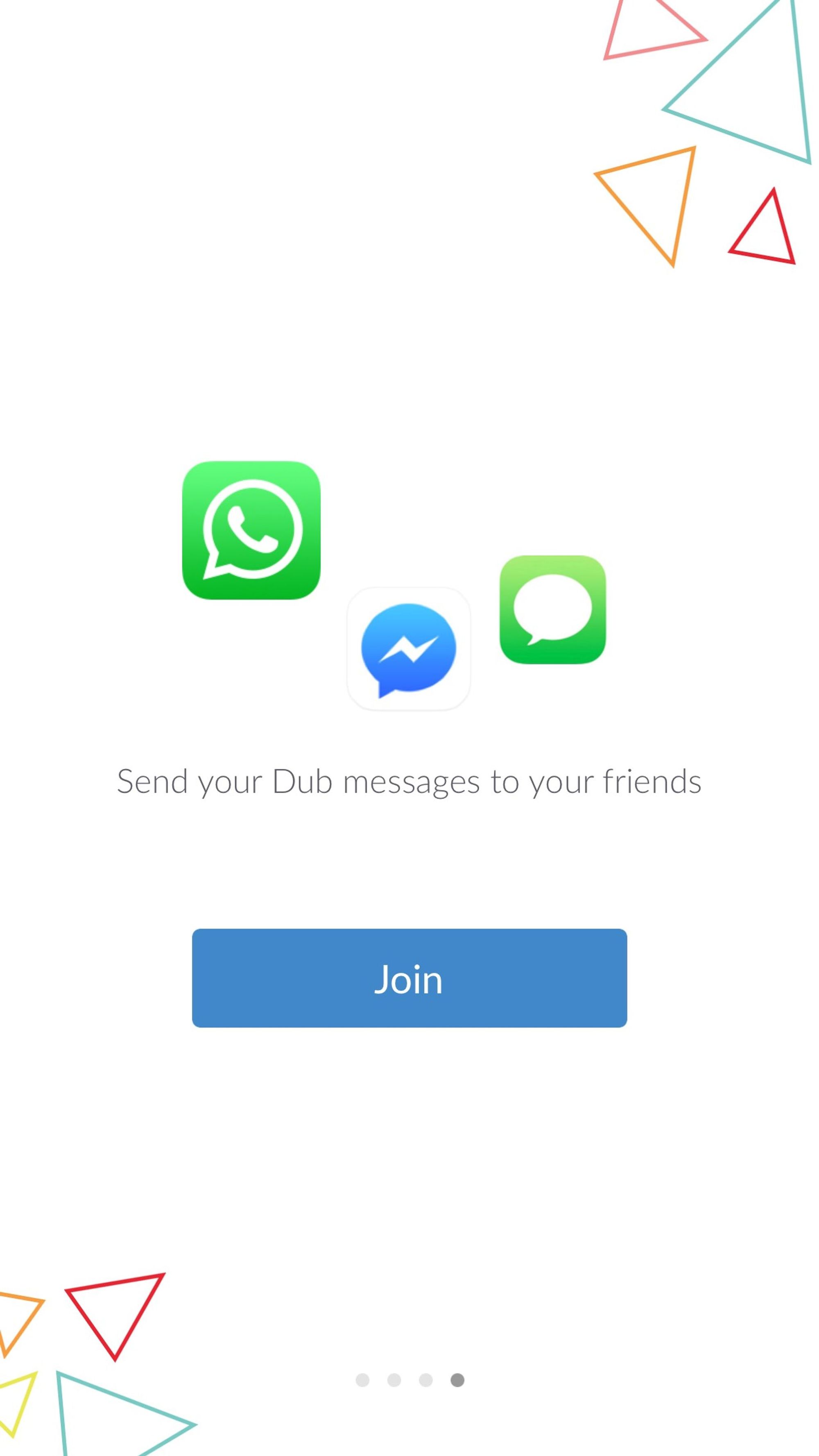
This new user screen does a great job focusing on one call to action. There are no decisions to make except for, “Should I leave the app right now, or should I press this button?” And since this very simple choice shows up after the user has installed and opened the app, it’s very unlikely for them to abandon it right here. The “Join” button is even animated to gently expand and contract, making it enticing to press.
Screen Two

As you load up this screen, they immediately start you off with the keyboard already up and blinking cursor in place. The reaction is to begin typing right away. The big “@” sign visually signifies what you should type in even as you begin typing and stop reading.
Screen Three
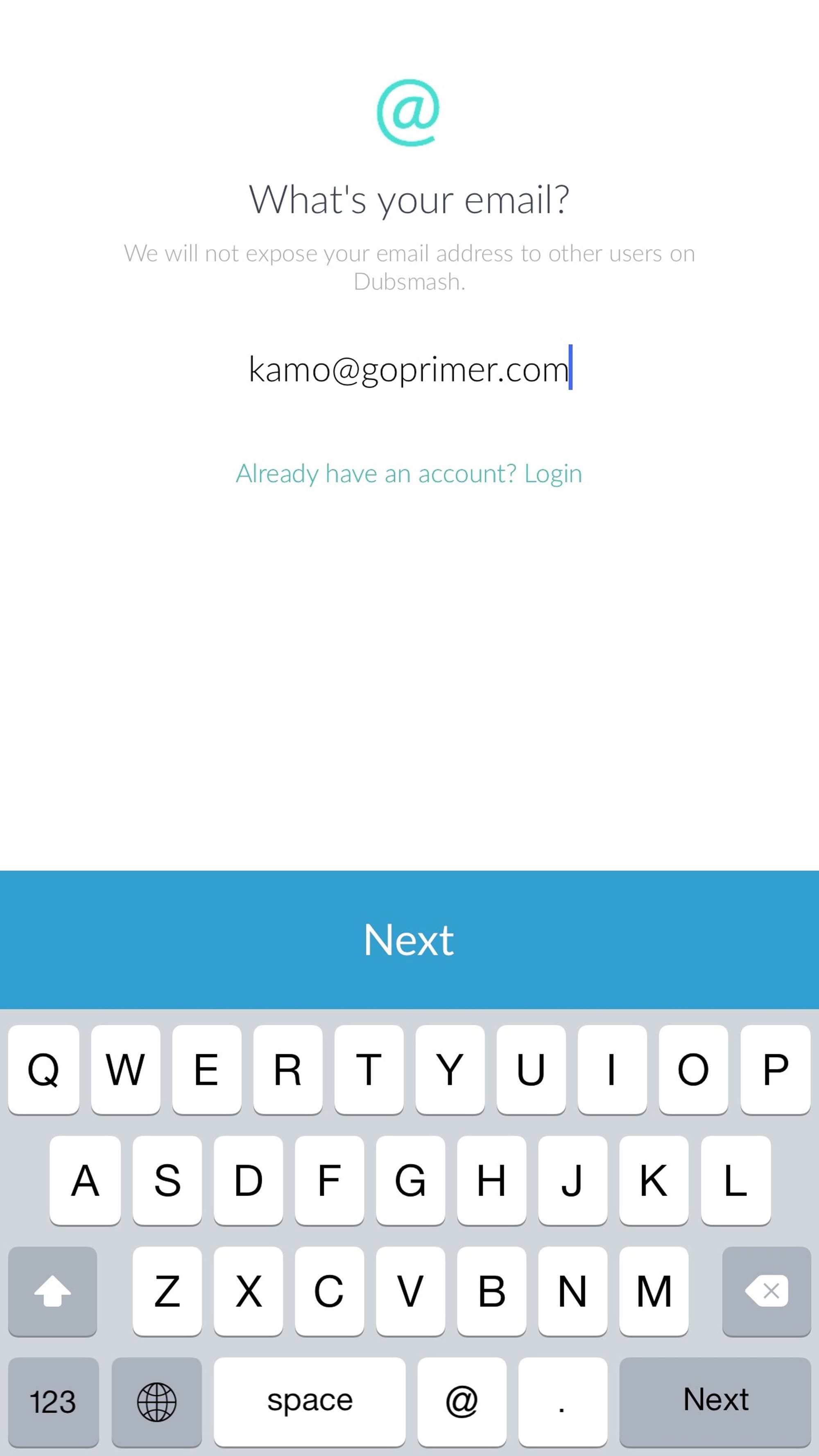
Once you add the finishing “.com” to your email address, the main call to action, which was previously not there, shows up on the screen. This flow really does a great job of taking users through one action at a time. The main CTA is not even present until the email is typed in. The CTA is large, is right next to the keyboard where your fingers were the second before you finished typing, and is the same blue color as the previous “Join” CTA you pressed on the screen before this one.
Screen Four
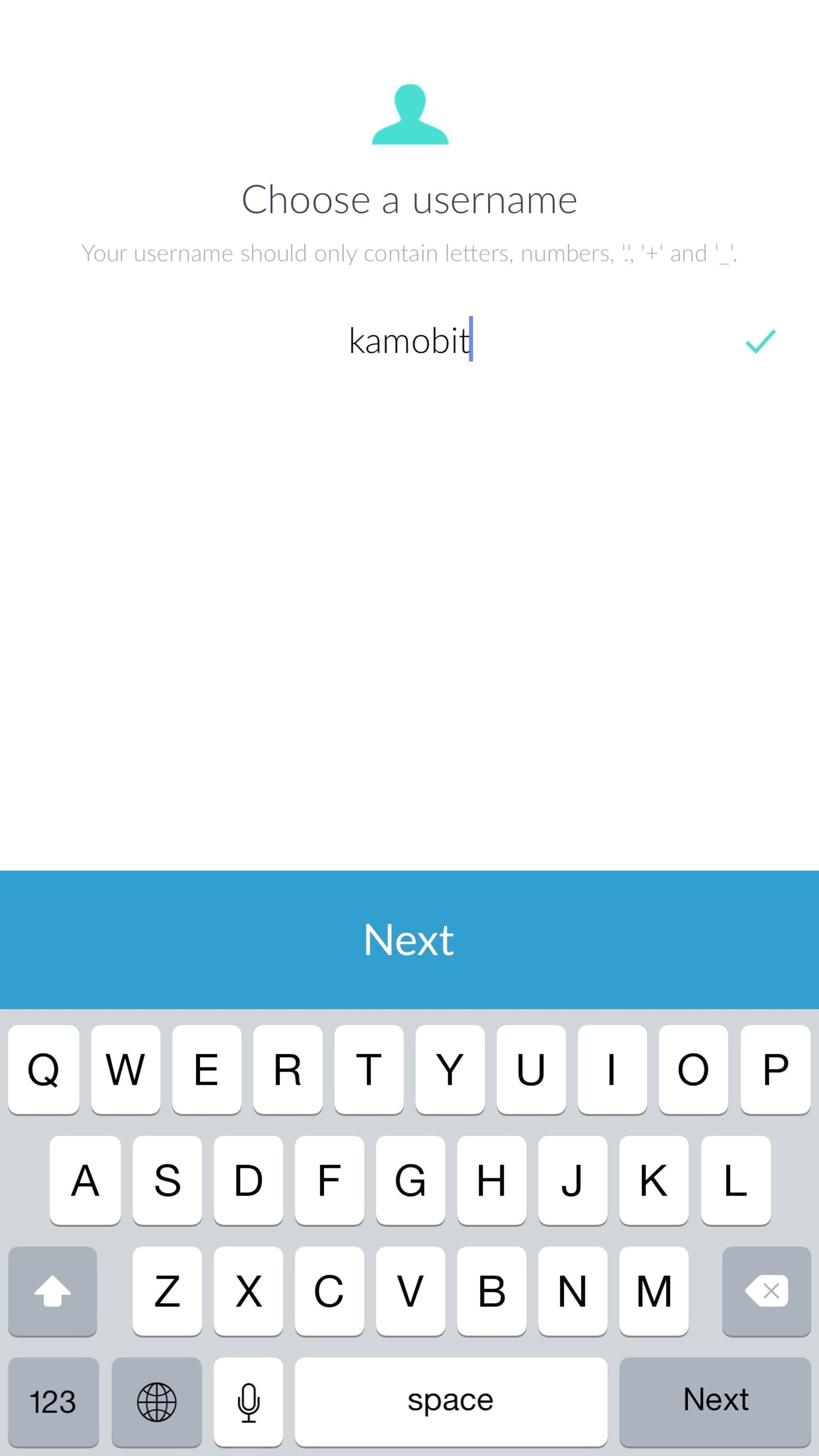
This next step starts off with a ready-to-use username which you can edit if you want. There is also a nice checkmark next to the input field which indicates that your username is valid and that you've made progress.
Screen Five
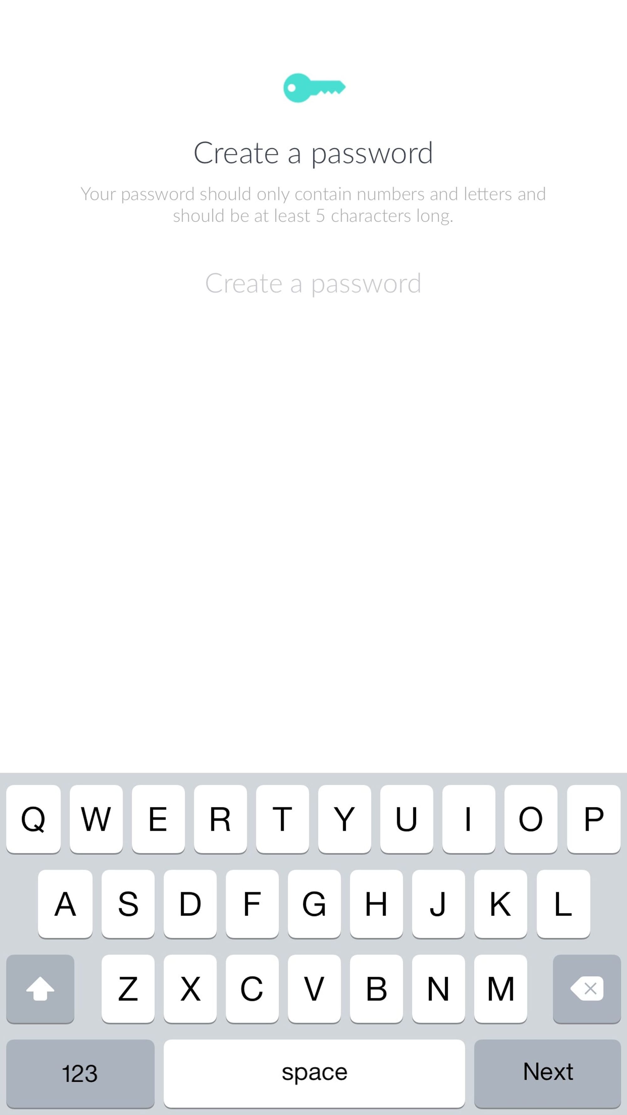
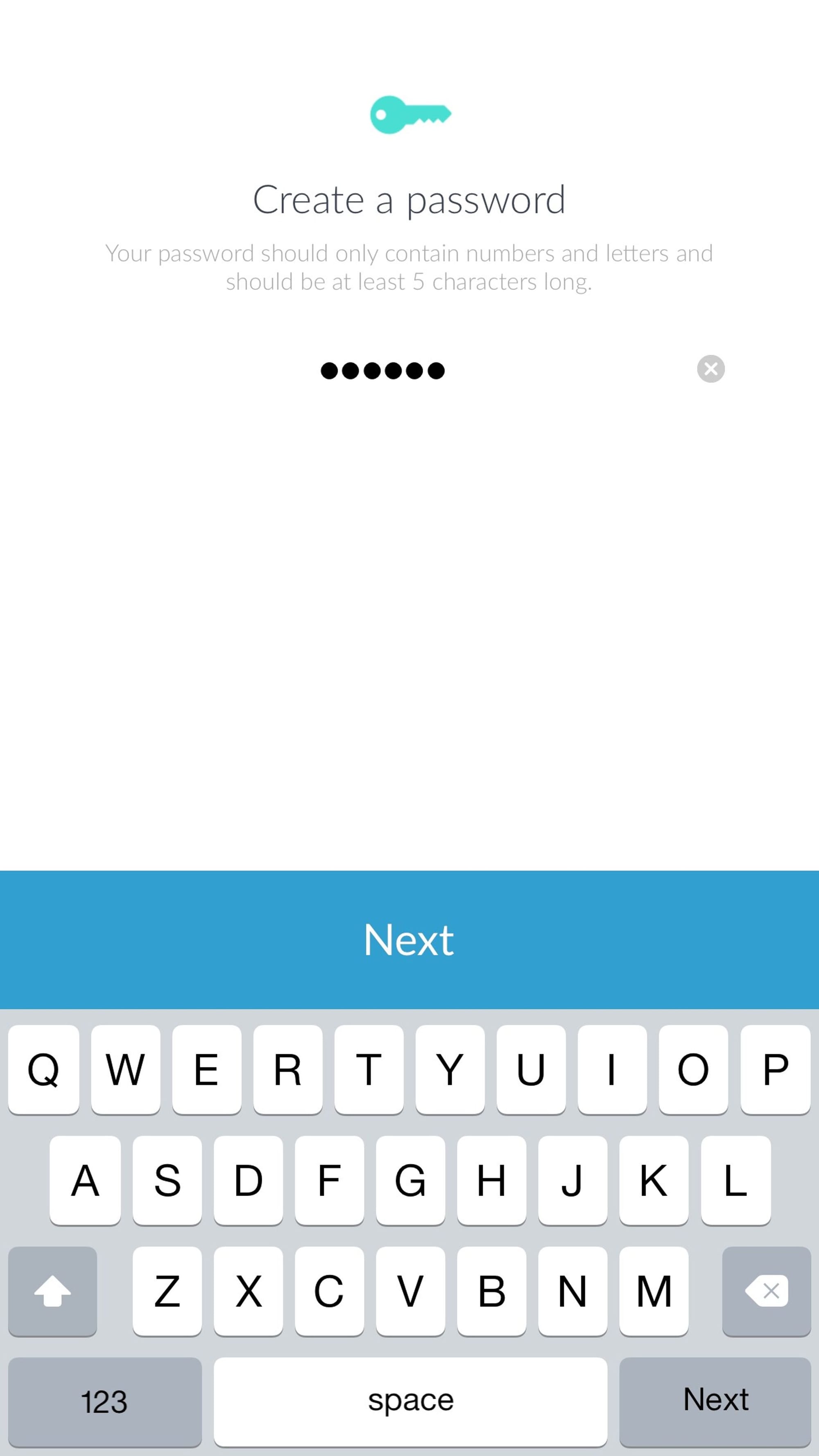
The password creation experience is also very consistent with that of all previous screens. The keyboard starts off being up, and there is literally nothing else to do (not even go back). There is a clear icon that visually communicates what this step is about. The supporting text under the main headline is low contrast against the background and is out of the way. You never feel that you have to read it in order to complete this step. The CTA is consistent in every way with previous CTAs.
Screen Six
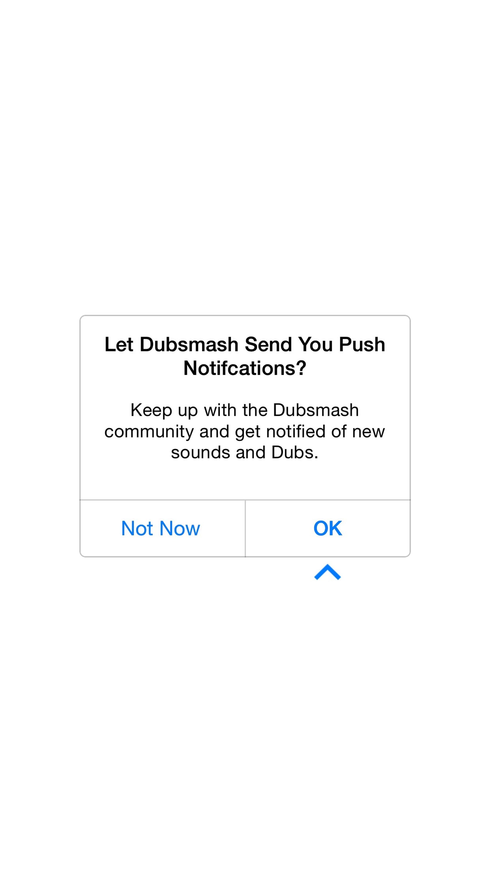
Here, Dubsmash continues to keep things simple and prompts you to accept push notification permissions with it’s own dialog that's clearly purposefully designed like that of the native iOS dialog which follows. The step is very simple and there is an arrow clearly pointing at the preferred action if you're familiar enough with this modal to skip all the reading and just press the CTA.
Screen Seven
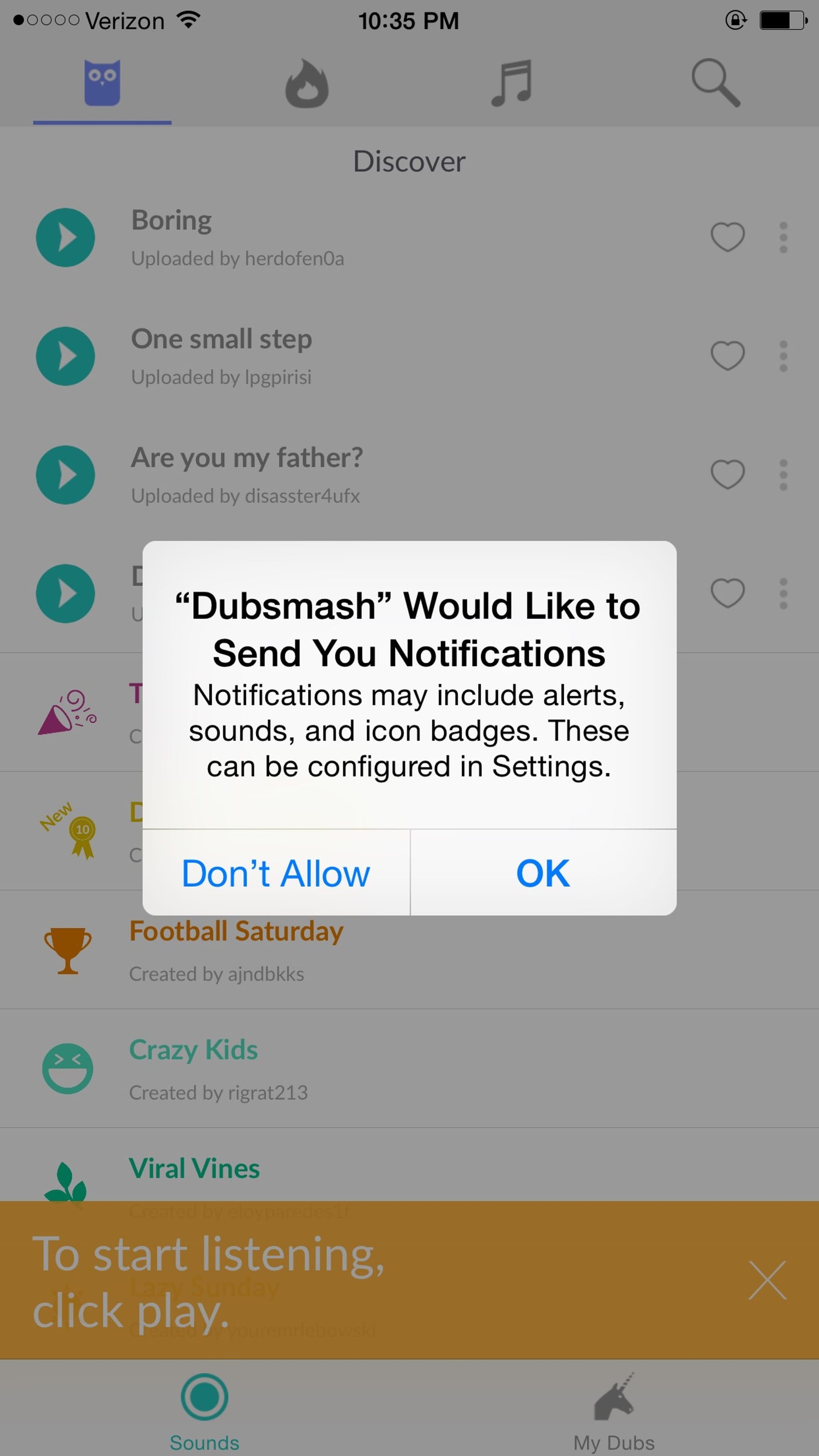
Assuming you pressed “OK” on the previous screen, now Dubsmash prompts you to press the same CTA on the iOS modal which looks almost identical to the one you responded to favorably a moment ago. You also get a preview of the app underneath, which is waiting to be uncovered if you just move past this dialog as soon as possible.
Screen Eight
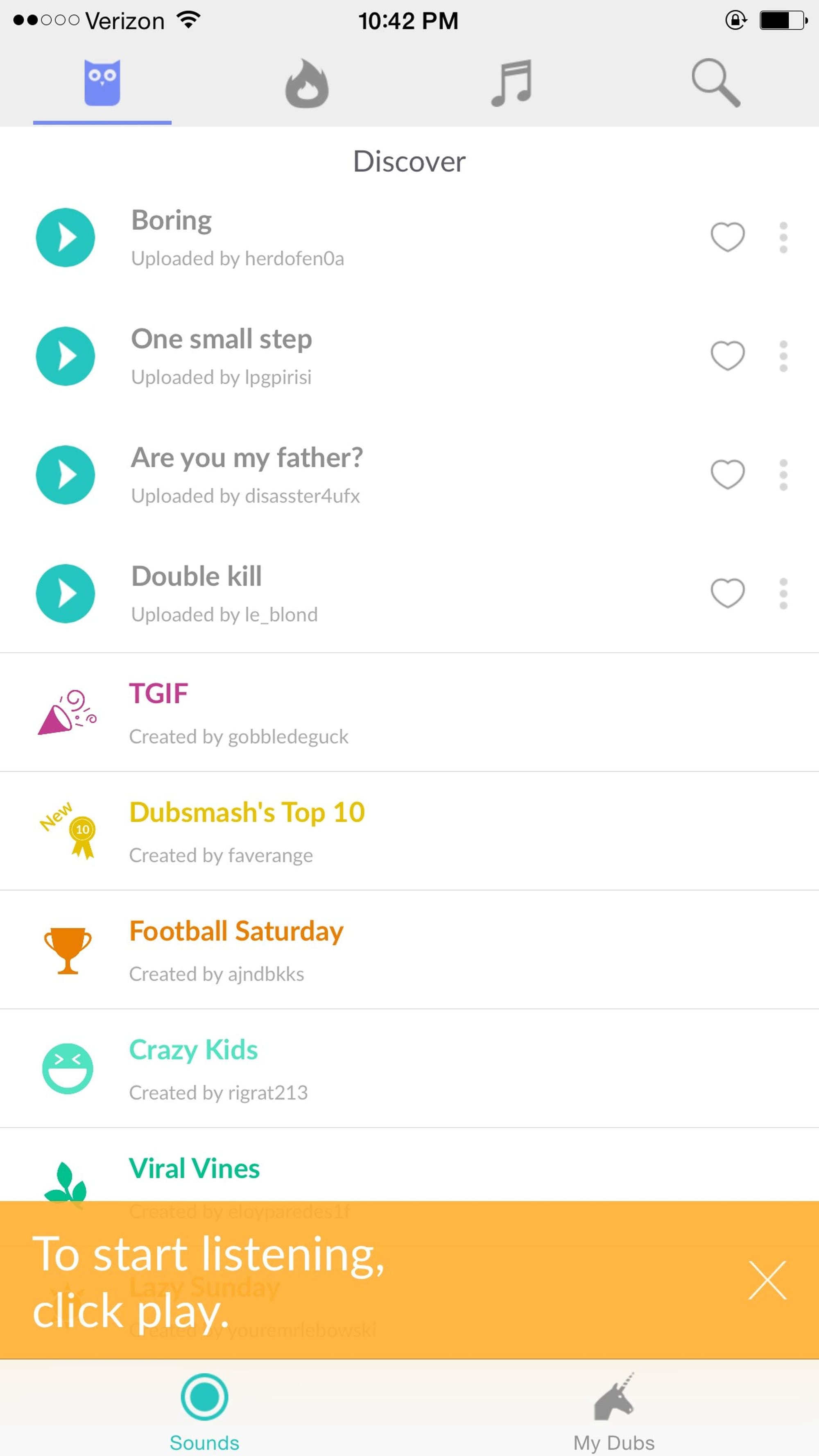
This last step could use improvement. Everything up to this point has been very simple with only one decision to make per screen and one action to accompany every decision. Suddenly, you arrive here and are faced with lots of small items to choose from without much clarity about which one to go with. The contrast between the flow leading up to this point and this step is very sharp. Some ways to improve this step would be:
- “Click” is a desktop word. Consider using “Press” instead. Also the word “play” does not instantly translate to the play symbols above because this text is too far away to be immediately associated with them.
- Make one of the play buttons gently animate like the “Join” button on the first screen.
- Change the word “play” into the actual button symbol so that it’s very easy to visually connect what the tool-tip is saying with the intended action.
- For a more drastic change, instead of sending users immediately here with all of the navigation tabs and full list of items, gradually increase the number of choices. Send them to a separate screen where the only thing to do would be to play one of three sounds and incorporate a “most popular” tag to reassure users that they can’t go wrong with any of the choices
Finding your killer welcome flow will probably be a matter of intense and continuous experimentation.
Now you know what to look for. (Incidentally, Primer helps make this type of experimentation easier by letting you do it outside of a traditional release process.) But the relative simplicity of these principles still doesn’t prevent most app from committing fatal mistakes in the first screens they show people. Here are just a few that Asatryan sees all the time and how to sidestep them the first time around:
1. Trying to sell users once again on the value of the app right after they install it. “Seriously, they were already sold on it when they clicked ‘Install,’” he says. “This mistake gets made because there is a strong desire to teach users and this seems to be the easiest way to do it. We rarely consider that users are not here to read about our app. They are here to use it and we have to get out of their way.”
2. Ignoring blank states. “How does your app look when a user has no profile picture? What about when they don’t have any friends who use it? Or if it’s an on-demand delivery app being used outside of its hours of operation? Too few people pay attention to these modes that drive away users.” These mistakes get made because the people building these apps don’t run into these situations personally that often, Asatryan says. It’s vital that you remember that many new users will run into these scenarios all the time. How can you limit their negative impact and make your app look less like a ghost town?
3. Trying to cater to every user at once. Many app makers make their login and signup buttons the same size and shape. But most users never log out of apps, so it’s unlikely that they’ll need to log in again. “That first screen you show people should be all about signing up. The log in button or link should be tiny in one of the corners. It should be there for anyone who looks for it, but otherwise it’s out of the way.”
Another error in this category is adding every possible signup option: Facebook, Google, Email, Phone Number, etc. When you make users choose, you add cognitive load and friction. Because users have a finite amount of mental energy they are willing to expend using your app for the first time before dropping off, it’s vital to help them conserve as much energy as possible. You want them to reserve that energy for the actions that activate and engage them for the long-term. Don’t waste it on them choosing which signup option to go with.
“Just see which option users are choosing most and get rid of the rest of the options,” says Asatryan. If two options are close, consider having one be dominant and the other secondary. But there should never be more than two options to sign up.
4. Not paying attention to what every screen looks like when the keyboard is up. In many cases, half of the screen will be obscured. Is the keyboard covering some vital piece of information or a link people need to progress through your app? Is it covering an important call to action? Never let this happen. Remember also that if you have international traffic, you need to accommodate different types of keyboards, unusually long names, and various load times for part of your apps.
5. Not paying attention to error states. What message do users see when they mistype their credit card number? Or don’t provide an accurate zipcode or formatted email address? There are countless things that could go wrong in one form. How do you alert your users to these facts? How do you make it easy for them to return to what they were doing? Sometimes these messages appear and they’re very technical and confusing, which can be terrifying and alienating to a non-tech savvy user.
Now, How Do You Take All This and Scale?
If you’ve internalized all of these best practices and pitfalls, you should be in a good position to scale a working strategy. But that comes with its own set of challenges. To take what you’ve learned and make it function for the long term, you need to first identify the pieces of your product that you know will require constant iteration. Whatever growth plan you put in place should include a system that allows for continuous tweaking, measurement and re-tweaking. Typically, these pieces include your onboarding flow, any organic growth channels — like social sharing or prompting users to refer or send invites — and any retentional channels like push notifications and emails.
In order to keep iterating, you should formulate your questions about all these pieces into specific hypotheses that you’ll be able to prove or disprove with data and experimentation. Will things change if you alter button colors? Your copy on a few screens? The way your signup form is structured? As you learn more about your users, your hypotheses will get sharper and more helpful. Don’t expect them to be razor sharp to begin with — the important thing is to continue making educated guesses with the best info you have at hand.
Lastly, the best way to test your most critical hypotheses is to make big noticeable changes to your product. That will give you a clear, decisive answer about what’s better in most cases. So let’s say that you’re not quibbling with button color, but rather rethinking the order of screens you present to people. You want to make a drastic change (at least for a percentage of your users, like users coming from a particular traffic source like ads or referrals) to get a sense of what’s truly important to them. You can follow this with fine tuning to dial in the optimal experience.
Of course the word optimal here is always qualified and should be a moving target. “Don’t forget that your userbase will never cease evolving and your product shouldn’t either,” says Asatryan. “Being good at mobile growth work is accepting that your work is never done.”
