Before joining Flipboard, Didier Hilhorst co-founded and designed IntoNow, the “Shazam for TV”, and contributed at IDEO as an interaction designer. Now, Hilhorst is a part of the product design team at Flipboard, where he helps shape one of the most popular apps on earth. The First Round Capital team was thrilled to host Didier at our Design+Startup event series where he shared Flipboard's design philosophy with the other 160 designers in attendence.
Make It About More Than Just the Designers
While your design team will be largely responsible for the actual design implementation, involve everyone in your company — from the engineers to the support staff — along the way. You want your company’s DNA to be felt throughout your product, and the only way to do that is to make the design process an inclusive one. At Flipboard, this mentality is pervasive: Everyone chips in and everybody understands what the product is.
Create an Emotional Connection
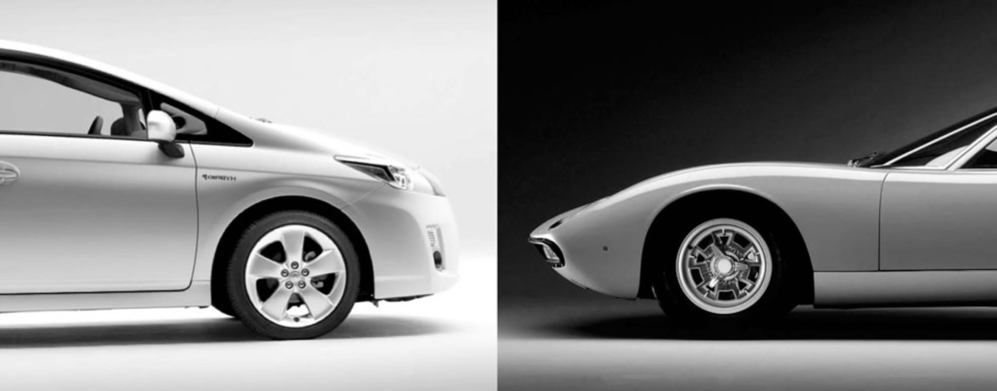
Regardless of whether you’re in the B2B space or driving a consumer product, it’s your job as a designer to create products that form an emotional connection. Envision the 1971 Lamborghini Miura. It’s an objectively beautiful vehicle, and you might even say “It screams sex.” More impressive than this car’s raw emotion, however, is its level of detail: When you open the car’s front doors, they look like the horns of a bull. While this type of design generally adds very little functionality, it manages to leave people exceptionally happy. And the best designers, digital and non-digital alike, make sure that their products evoke this sort of delight.
The Prius, on the other hand, is the “anti-car,” driven by data and efficiency. While it’s not fair to say it doesn’t create an emotional connection, the principles behind it are completely different. Whereas the Miura might invoke an extremely emotional sentiment, the connection you have with a Prius is bound to be much more practical.
Taking Product Inspiration & Design Philosophy from the Physical
Flipboard takes its product inspiration and design philosophy in part from the beauty of print.
Newspapers and magazines are beautifully laid out, and are still very much an amazing form of design. But like so many physical products, they don’t always translate well to the digital realm. Between the browser, complicated menus, and obtrusive ads, websites used to be crummy. And when you compare the magazine to its website counterpart, it’s a completely different experience.
The iPad disrupted this: Suddenly you could touch content. At Flipboard, this meant that the company could finally design in such a way that it could take the beauty of print and combine it with some of the functionality that the digital world allows.
When you pick up a magazine, there’s no manual. It has no buttons, no sign-up flow, no Facebook Connect. Flipboard takes a cue from that. When you open the app, the first and only thing to do is flip. The same goes for layouts and articles. Flipboard designs beautiful interactions with less navigation so that it becomes an experience to use the product.
Print is an inspiration, but it's not the objective to present a replication. Rather, it's to take the best qualities of print and bring them to a new medium in a way that is authentic.
When you’re designing, especially for content-heavy applications, there are UI elements that wouldn’t make sense in a print layout. Some things are still lists and some things require a user interface.
Flipboard’s goal is to separate these two spaces, because if you try to combine the two, it won’t work well. This extends to the car metaphor: If you try to combine a Lamborghini with a Prius, you probably won’t get a great car. As a designer, you have to decide when and where to apply a more traditional UI, where you have the functionality, and where you can take affordances. In Flipboard’s case, it’s from the print world, but it might be different for your organization.

Taking Inspiration from “Old Stuff”
Take the original Polaroid, which was a total hit. You could snap a picture, get a photograph, and share it with friends in a matter of minutes. It was instant. It was social. And it may have been the first real social photography product. Instagram took a cue from this invention by providing more than just great filters. Hipstamatic showed us that you can create great filters on an iPhone, but it was Instagram that realized that sharing photos with friends and then designing their product around that interaction is what’s really cool.
This same phenomenon is true with IntoNow, the “Shazam for TV shows,” which takes a lot of inspiration from old-school television. Every time the app processes audio in an attempt to figure out what you’re watching, it displays a fun screen that makes it feel like you’re not really waiting.
Being able to take inspiration from legacy products and creating a fun element around it is a key ingredient in the product development process. While some discount these small details, the best designers recognize how critical they are to a product experience that creates an emotional connection.
