When Lumosity launched in 2007 to help people strengthen their brains with mental games, it exercised a common theory: The easier your sign-up process, the more users you’ll bring in, the faster you’ll grow. And for the most part, they were right. But what happened next surprised them: As they made registration more complex, users actually became more valuable.
At First Round’s recent Design+Startup event in San Francisco, Sushmita Subramanian, Director of Product Design at Lumosity, shared how adding friction to a product is sometimes a good strategy and can increase the long-term value of the users it attracts. She has a lot of data to prove it. Lumosity experimented extensively to strike the right balance between ease and complexity, and its counterintuitive moves have helped propel the company to the forefront of its field.
The Myth of Reducing Friction
At first, it seemed obvious to the Lumosity team that they would need to make their product as effortless as possible. Exercising your brain is just like exercising your body. It’s good for you, but it also requires willpower and discipline that most people lack. Getting people to train regularly was going to be a challenge no matter how entertaining they made the games. At the very least, they figured they could get people to sign up by making the process simple and easy.
“We worked hard on the games and training system we have on the site, we really wanted to get users in and training as fast as possible,” Subramanian says. “If you look at other apps and websites, it seems like most ask for a minimum amount of data — people can connect with one click, one tap.”
The real question is will these users come back tomorrow? In most cases, they won't.
Gradually, as they learned more about their users and how they were experiencing the product, Lumosity tested different sign-up flows. They added survey questions, asked for more demographic information, etc. “What we found is that sometimes friction can help you acquire customers that really believe in your product, who want to build a long-term relationship with your company,” she says.
When you rush users through the door, it’s easy to miss out on these opportunities. Slowing things down can yield surprising benefits, you just have to make sure you’re doing it for the right reasons and in the right places.
Find Your Most Valuable Users
“As more people signed up, we realized we had a really wide audience — from students to professionals to older adults,” says Subramanian. “In order to create personalized training for each of them, we needed to learn about their goals and expectations for the product.”
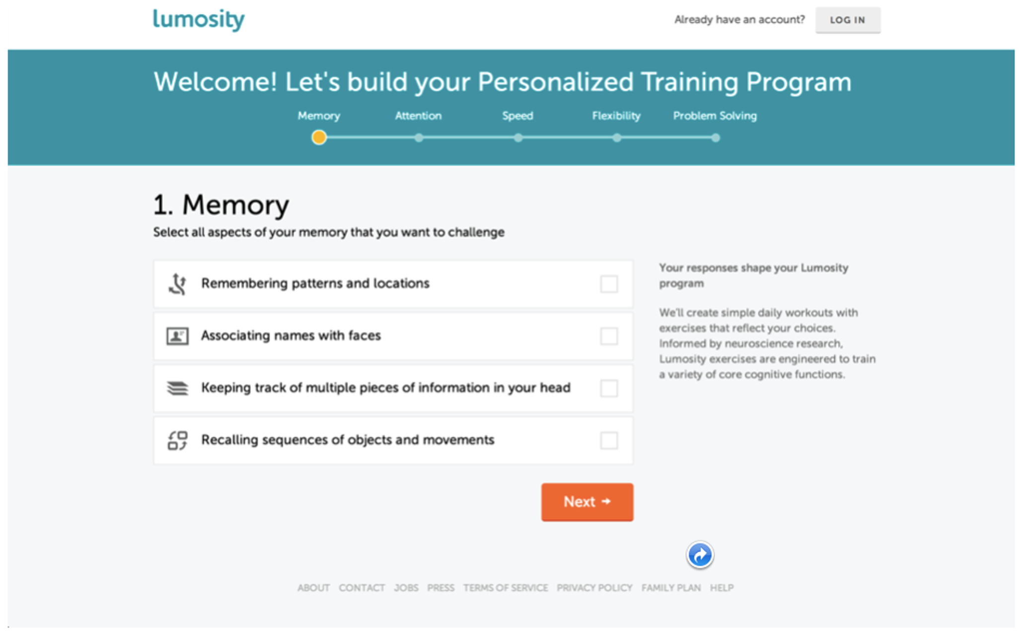
To collect this data, they added several survey questions into the sign-up flow, including questions about their cognitive goals and the industry they worked in. This continued for several pages before users had the chance to register and start playing games.
Initially, the team assumed this would lower registration rates, but would be worth it in the long-term to help them learn more about their users. What they found didn’t just benefit their research — they discovered that users actually answered the extra questions in full. Surprised by the results, they decided to make the questions an intentional part of the sign-up experience.
After landing on the Lumosity homepage, interested users were first directed to survey questions about their cognitive training interests (i.e. memory, attention, problem solving). This continued for FIVE pages before users had the chance to register and start playing games.
Every step of the way, Lumosity conducted A/B tests and talked to customers to validate that they were on the right track.
“We tested the five-page survey against a flow with no survey and we found that the former did in fact slightly lower the number of people who actually signed up. But those people who made it through were more valuable — people who were willing to invest in our product, who would pay to subscribe, who would continue to use it for a longer period.”
Parsing these results, the Lumosity team came up with two theories:
- Personalization: Asking people about their interests gave them the unique chance to influence the product they were about to use. Yes, it required a lot of upfront investment, but they could be confident that they were improving their future experiences.
- Education: Something like brain training isn’t well-known or understood by many people. The longer sign-up flow gave Lumosity a way to explain more about brain training, why it’s important, and how the product helps.
These were positive outcomes, but there had to be a way to capture the same effects while upping registration rates at the same time.

Optimize with Friction
To double down on the principles of education and personalization, Lumosity redesigned its core content to emphasize both. They added more educational content to the homepage, highlighting the scientific research supporting their game designs. They also made it clear to users that their first day of training would influence their game play experiences in the future.
With all of this in place, they decided to A/B test the sign-up flow again to see if things had changed. The results were largely the same: More users signed up without the survey, but those who took it ended up subscribing at a 10% higher rate.
“We were a little puzzled by this because we thought we had captured principles of education and personalization in other parts of the experience,” says Subramanian. “This led us to think about a third principle: reflection.”
Reflection: The team knew from neuroscience research that prompting people to be introspective before sharing information about themselves activates parts of the brain associated with rewards — just like food, sex, money. They started thinking about how to build this into the product as well.
From there, Lumosity’s team decided to see how much friction they could introduce using these three core principles:
- Education: Helping users better understand the bigger picture value of the product.
- Personalization: Letting people tailor and improve their future experiences with the product.
- Reflection: Allowing people to reflect and share information about themselves.
They played with the number of options people had to decide between for each survey question — seven proved to be too many; four was just right. They even added more survey questions into the mix.
“We continued to add friction to the experience, and we found that adding more and more pages of questions helped us learn more without hurting the value of our customers at all. We actually saw a slight lift in both engagement and subscription rates of about 2%,” Subramanian says.
Lumosity continues to test and experiment with the sign-up experience. For example, they recently tested moving their sign-up fields earlier in the flow and found people responded differently to the ordering on desktop versus mobile web.
Keep People Coming Back for More
With plenty of sign-up experimentation under their belt, Lumosity wanted to apply the same learnings to improve engagement with the product. They wanted people to actually use and benefit from the games they had designed.
“For the most part, we want to get people straight to our games so they can train, so we weren’t sure if adding friction into day-to-day use of the product made sense,” says Subramanian. “We definitely didn’t want to get in people’s way when they were coming to do a workout.” Reviewing the three principles they surfaced during the sign-up flow, the team considered how these apply to training:
- Education: Lumosity assumed that when people were regularly coming to train, they probably had enough context. They didn’t want to waste any of their time teaching users more about the product. The site makes plenty of information and research available for users who want to learn more outside of the core experience.
- Personalization: Lumosity also played with the amount of control they wanted to give people in terms of what games they play and how they shaped their training sessions. “It’s been an evolution, but we see the best performance when we personalize people’s workouts for them. That way, they can buckle down and just focus on the training itself,” Subramanian says.
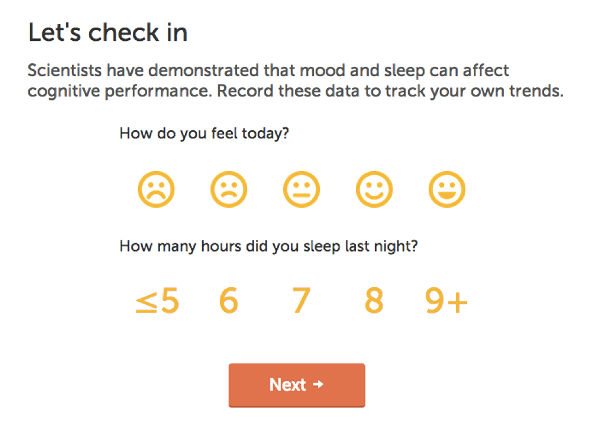
- Reflection: At Lumosity, they’ve heard a lot of users express curiosity about how other parts of their lives affect their brain training. So they added two simple questions right before users start playing their first game of the day, asking how they feel and how much sleep they got. Then, at the end, they ask about alertness and energy levels, and users can add notes.

When the team A/B tested asking these new reflection questions versus not, they were pleased to see that the additional friction didn’t do any damage. In fact, it helped more in terms of both engagement and subscription rates.
Qualitatively, users seem to feel a connection to the product. They post on social media, share stories, email Lumosity and tell very personal stories about how brain training has affected them.
At its core, Lumosity is a neuroscience research company, and identifying and leveraging the three areas where friction makes a difference has allowed them to learn more about their users, and in turn, create a personalized brain training experience for their diverse user-base. Today, Lumosity has over 60 million registered users, and it’s their goal to continue to learn more about cognitive training, offer the best, most accessible brain training program, and provide their users with more insights about themselves.
“Reducing friction is still a valid strategy, but before you step out of the way and let people speed through an experience to jump in, you might want to think about where asking questions and adding points of complexity might help establish a dialogue with your customers,” Subramanian says.
Ask yourself: Do prospective users know enough about your product to take action? She recommends looking through your user flows and focusing on crucial drop-off points. “Create A/B tests to learn more about how you can provide additional context at those moments where you can help people make good decisions.”
The takeaway: Don’t shy away from learning more about your customers because you’re worried about turning them off. There is clear evidence that people want and even expect products that they plan to use for a long time to be tailored to their specific needs.
“Give your users a chance to tell you more, whether you use feedback surveys or other opportunities within the product itself,” Subramanian says. “Give them a chance to reflect on their experiences with your product. It could help create valuable relationships and value for your company."
