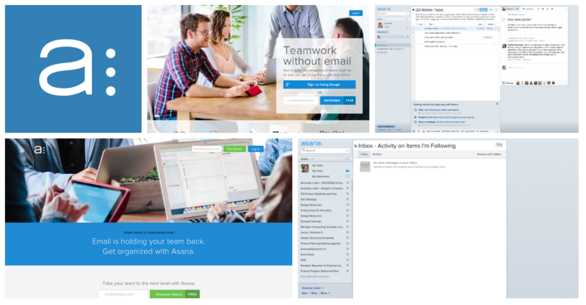
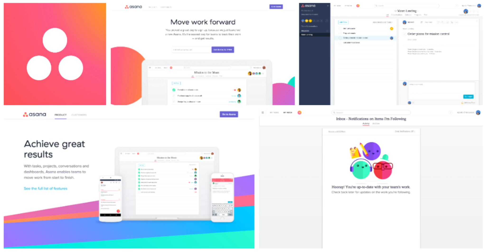
Product redesigns heat sink to headlines: Instagram Gets the Redesign We’ve Been Waiting For. Medium’s redesigned website wants to bring us back to blogging. Facebook co-founder Moskovitz retools look of future-of-work startup Asana. Then there are your users. Whether it’s a consumer or enterprise product redesign, they’re the ones who declare success or failure — either through praise and referral or by voting with their uninstalls. How can a company own its evolving identity when the verdict on a redesign so often comes from the tastes of its users?
Asana product manager Sam Goertler has thought about this question a lot, especially as it relates to improving team collaboration. As an early member of Asana’s product team, she’s focused on building an easy and powerful product that helps teams track work better together. Previously at Yammer, Goertler worked on enterprise social networking in its early days. She’s familiar with the late-night pushes, behind-the-scenes kerfuffles and the ramp up to the big unveiling. There’s also the redesign expectations that can split like a middle school dance. On one side are the designers, with their big dreams, expansive thinking and hope for a silver bullet to fix all product problems. On the other are the PMs, grappling with impossibly high stakes, fear of user backlash and complex plans to execute. And those are just two types of stakeholders.
In this interview, Goertler covers why redesigns — even of apps users have already come to love — are as difficult as they are inevitable and how to navigate them with grit and grace. Using Asana’s successful redesign as a case study, she outlines the team who needs to be assembled, the obstacles to flag and how to plow through them. Lastly, she digs into how to take a uniquely iterative approach to a redesign and when to declare success.
Why Redesigns Are So Hard But So Inevitable
There was a time when Microsoft Word came out with a new version at the same cadence as the Olympics, but that time has passed. People have adopted agile methods and rapid release cycles. There’s a shorter runway to extend design systems now; the unit of time is weeks not years. It’s not unusual if SaaS companies ship new functionality every few weeks, so redesigns become a natural consideration to match faster product development cycles. According to Goertler, there are two key factors — one external, one internal — primarily driving this change.
The prevalence of digital interfaces in our daily lives has accelerated the evolution of design trends. “Pretty much everything we do now, whether it's shopping or managing our finances or making a doctor's appointment, we're doing it through a digital interface,” says Goertler. “That means there are more designers out there who are collectively advancing design languages and pushing visual styles forward. In turn that leads to a faster rotation of design trends. It’s a virtuous cycle.”
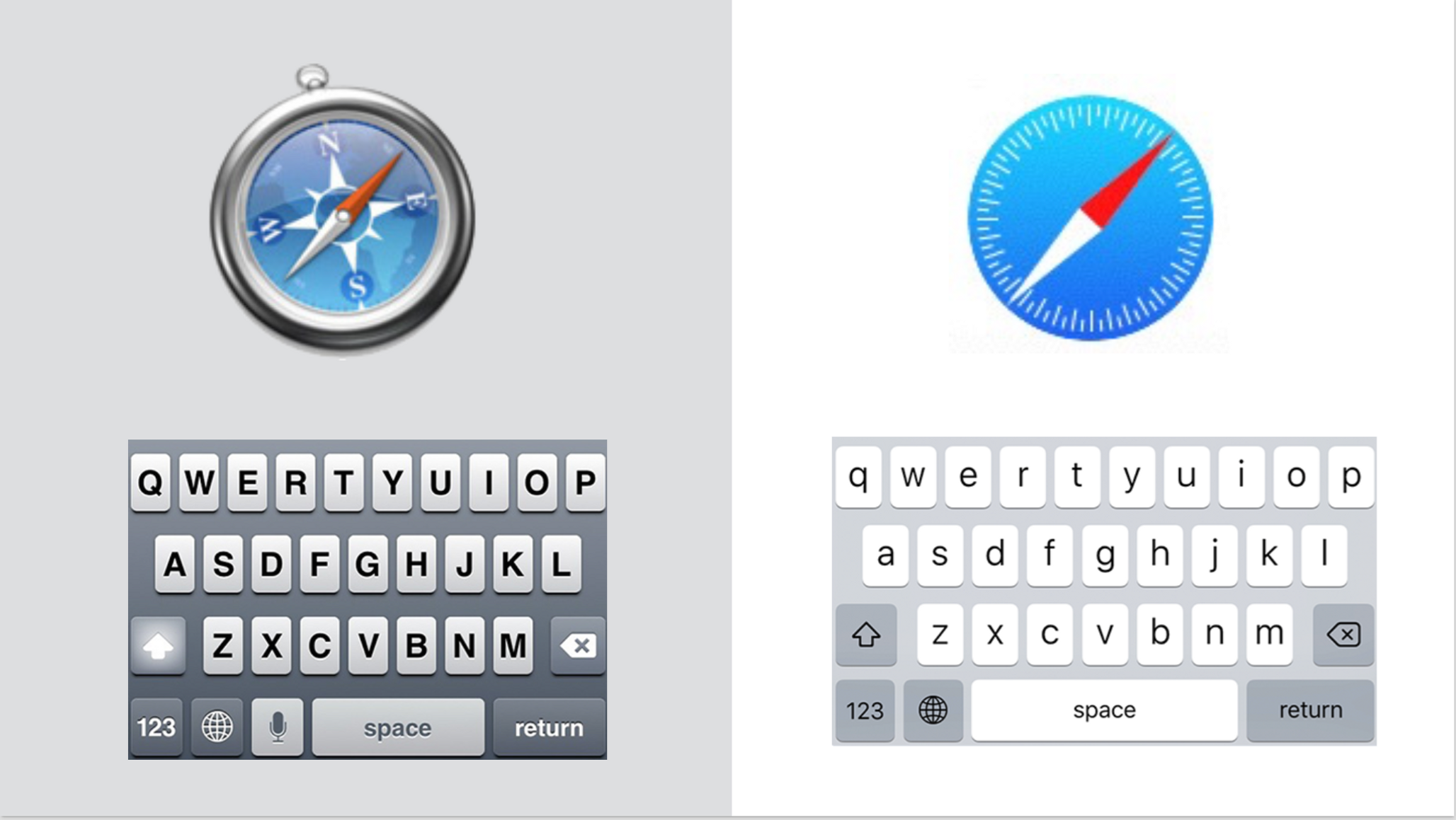
But virtuous cycles are also vicious ones. Those who don’t spin at the market’s speed can be spat out entirely. “What it comes down to is that design trends are moving quicker than ever. As soon as a new style rolls out, the previous version seems incredibly outdated by comparison,” says Goertler. “One stark example is when iOS launched it’s new flat design to replace a more skeumorphic design that had been long favored by Steve Jobs. Now, if you look at that early design, it feels like a relic from an older world. Iconic brands like Apple endure because they evolve their brands. If you can’t keep up, you’ll have a tough time attracting and retaining users.”

If the rapid cycle of design trends is the external trigger for a redesign, there’s another internal reason one should be initiated as well: the pace of product development. “It's not just design trends that are moving faster. We’re seeing more functionality and features developed in a shorter time span,” says Goertler. “In a year, you can go from an MVP to a product that’s chock-full of functionality, which, when more features are piled on at top speed, can become untenable. That’s when you hit the limits of your original design. You can’t extend your design system to accommodate new feature development. So it’s time for a redesign. The alternative is to continue cramming everything into an already cluttered UI, which stifles all your feature development work.”
With dynamic forces at play, you’d think it’d be relatively easy to jumpstart the redesign process. Yet there are cases in which executive teams and product managers can drag their feet with redesigns. When they do, let your users speak for you. Here’s a closer look at these key stakeholders:
Expect executive teams and PMs to take a risk-averse stance towards redesigns. “It's definitely tough to get their buy-in for a redesign. They tend to prefer projects that are more straightforward in terms of returns on investment and amount of risk,” says Goertler. “For example, by comparison, feature development work can seem much more appealing to PMs and executives because it's presumably more straightforward to build features incrementally. That means lower risk and clearer metrics for success with the help of A/B testing. The assumption is that in order to successfully execute a redesign, you have to go heads down for several months and come out the other side with a big reveal. You cross your fingers that you didn't miss the mark. That can be very scary and unappealing for executives, PMs and other key stakeholders.”
Highlight the urgency for a redesign by channeling your users. Your users are your bellwethers and spark for a redesign, so poll them every 24 weeks by folding in a question about design in your periodic surveys. If you’ve already made the case for hitting the limits of design extensibility, stifling the success of all feature development or cluttering your UI, let your users speak for you.
“If your company still isn’t feeling the need for a redesign and kicking the can down the road, reach out to your users. I think the best way to track the need for a redesign is to get a pulse from your users through net promoter score (NPS) surveys. A lot of companies use NPS to gauge word-of-mouth growth, so it’s a familiar tool for both companies and customers. It asks whether or not they’d recommend your products, with an option to give additional color,” Goertler says. “At Asana, we were seeing that the original design was the top reason why people wouldn’t recommend our product. That was a clear sign that we weren't able to fit into our users' modern lives and our cluttered UI was preventing them from getting value out of new functionality. It was evidence that our design was hindering us from growth and engagement, two metrics that grab the attention of and matter deeply to executives and PMs.”
If your users don’t swing internal momentum for a redesign, mirror the tactics of the product team. That doesn’t mean changing the goals of the design team to those of the product team, but rather adapting to the way they achieve and measure objectives. “We mitigated internal concerns about a redesign by pitching an incremental strategy that would take all the benefits of what we've learned from the feature development process and apply it to the redesign process,” says Goertler. “This approach allows you to validate your assumptions early, build momentum, know when to change course and recognize when you hit diminishing returns. When we were able to take those aspects of feature development and apply them to our redesign strategy, everyone got on board.”
How to Assemble Your Redesign Team
A redesign affects not only how your company uses your product, but how they connect and feel about it on an instinctual level. Logistically, that means that this is a unique undertaking that impacts the entire organization, but practically cannot involve everyone at every step. Here’s how Asana built its team responsible for its redesign:
Convene a temporary, cross-functional crew. Goertler, as product manager, and Vanessa Koch, the lead designer, partnered to spearhead the redesign. They assembled a team of product managers, designers, executives and user researchers who’d work together for a defined sprint. “It’s important to have two leaders — one from product and one from design — to make this work. Vanessa was a huge part of why this project was so successful for us. She was able to get the entire design team involved in the exploration phase of the project where we were considering all the different visual styles and UX changes to make. She was able to get input from the entire design team and consolidate that into a single vision, which is critical,” says Goertler. “As for the team, we organized our ‘program,’ which for us is a cross-functional team that’s assembled for a four-month period to solve a higher level problem. In this case, it was about user confusion — we didn’t yet know that a redesign was the solution. We received a signal from our NPS reports that our UX was puzzling to users and that we needed to dig into the problem. Only then did we realize the extent of the issue and the need for a full overhaul.”
The key to the genesis of our redesign was that we first convened to solve a problem, not to implement a solution.
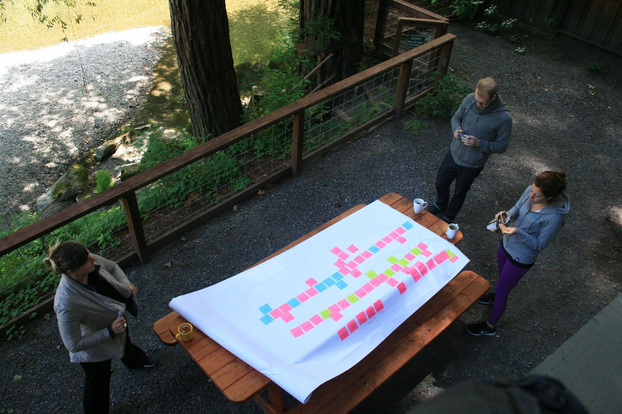
The redesign program kicked off its collaboration with the team by relocating to a cabin in the woods. The goal was to get out of the office, block off a huge chunk of uninterrupted time to work together while not being distracted by the existing design. “The team — designers, product managers, executives and user researchers — got started with brainstorming exercises led by our user research team. They’d paint the picture of the problem by presenting a lot of qualitative data gathered from users,” says Goertler. “Then they’d pepper in anecdotes. One use case was about a construction company that uses Asana to help their team coordinate homebuilding. We really got to know exactly how users work, how they use our product and what other products they use to get their jobs done. Once we had a really clear understanding of their workflow, we then started to brainstorm ways that our product could improve the way they tracked their work."

Resolve philosophical differences by picking up from pain points. The contingent of product managers on the redesign team were eager to use an iterative methodology to product development. Broadly speaking, that meant starting with an MVP, A/B testing it and iterating to a better end result. Yet that approach didn’t immediately sit right the designers. “They believe that a redesign is more than the sum of its parts. As such, they couldn’t imagine launching a redesign in a piecemeal way or stomach putting users through a Frankenstein experience, where parts of the old style would exist along remnants of the new design,” says Goertler.
Goertler and Koch wondered if there was a way to get the best of both worlds and marry the instincts of the designers and PMs on the team. They found a way to take an iterative approach, while also building in a grander unveiling that was more comprehensive and holistic to users.
“Instead of choosing the designers’ approach over the product manager’s methodology, we looked deeper into what the users had flagged as the main problem. We realized there were two sets of issues: structural issues, such as broken navigation and lack of hierarchy, and visual issues, such as outdated button styles and a drab color scheme,” says Goertler. “Making this distinction in the pain points allowed us to merge our team’s different philosophies. We realized that we could incrementally launch structural improvements in our old visual style without putting users through a Frankenstein UX. Once the structural changes were integrated, we could do a visual refresh in one fell swoop, having already mitigated the risk of user backlash because they wouldn’t have to change their workflows overnight.”
We knew the designs were going to shift, but we needed a North Star to guide us through the incremental work.
How to Take an Iterative Approach to a Redesign
At Asana, an incremental, iterative redesign plan got the green light, but it didn’t immediately quell all the concerns or rally the organization. It took more steps to transform the nervousness into productive teamwork. To kickstart the iterative style to a redesign, draw from the same methods used in feature development: Set a general vision, break it up into independent parts and sequence their launches. Here’s how the redesign team got the process started:
- Set a general direction. “Our user research team led brainstorming exercises to tease out a vision that would solve our user confusion problem. Our design team laid out specific possibilities that might improve clarity for our users. After our trip to the woods, Vanessa took all of those ideas and consolidated them into a single concept mock that didn’t have to be perfect,” says Goertler. “Since everyone knew we were taking an incremental approach, it was easier to get consensus on a general vision and buy-in from other stakeholders. Everyone knew that we’d never have to ship those initial designs, so it lowered the stakes and made it easier not to nitpick over which shade of blue was best.”
- Break up the design into parts. “Once we had the general direction, we had to build the steps to get there. That meant breaking up the concept mock into all of its independent parts, such as top bar and sidebar navigation,” says Goertler. “It can be easy to lose your way here, so lean on a mantra — we used ‘maximize clarity.’ As we put designs together we had many versions of the new navigation. So we returned to our mantra when we got stuck. If we thought one design would bring more clarity to a user than the other, we chose it and moved forward.”
- Sequence the launches. “After identifying the independent parts of the redesign, we had to figure out how to sequence the launches in a way that would optimize for learning up front. To do that, we listed out what we believed we could learn from each individual release,” says Goertler. “If it was a huge departure from the status quo or if it was a design based on assumptions that we weren’t able to test with a prototype or get user feedback on, then we knew we had a lot to learn from actually launching it. We wanted to get those insights early on so that we could course-correct our way to the best end state.”
- Validate assumptions early. “The major advantage of an incremental approach is to learn along the way. You get to answer your biggest open questions before making big decisions on false assumptions, and therefore lessening the chance of a big catastrophe down the road,” says Goertler. “But another advantage is that you can also build momentum along the way. You’re not holed up in a room for months with the A Beautiful Mind approach — you can ship, get feedback and garner trust with the organization.”
- Notch a first small win. Even after Asana initiated its plan for a redesign, there were still nerves. It took a mini-victory before people truly got on board with the redesign. “Sentiment finally changed as soon as we got initial results from our first few launches. Showing how our work was moving the needle helped to change people's minds and get the company to rally around us after that,” says Goertler. “Our first launch was a redesigned top bar navigation that we had A/B tested. It was a big victory for core metrics. Once people saw small changes working, they realized they didn’t need to be afraid of a bigger transformation.”

How to Let Users Help Guide Your Redesign
It’s critical to define a rough timeline, launch strategy and feedback loops, but your users will help you refine each of these elements. Here are Goertler’s recommendations on what to do to allow your users to have an additive role in your redesign.
Sprint to a signal, not a deadline. The Asana team working on the redesign did not linger, but they also didn’t drive to a predetermined deadline. “While we did have an upper limit of how much time we want to spend on the design, the more valuable measurement was time-bounding our efforts to get a specific signal,” says Goertler. “Remember, we were working through incremental steps. We would sprint towards the next launch and once we had A/B test results from that launch, they’d give us signal on what to do next. We let the strength of a signal guide us. For example, the navigation launch was a huge win for our core metrics. But as time went by, the effects of each subsequent change was more and more subtle. That’s when we knew that there's probably higher impact work to be done elsewhere in the redesign versus chasing diminishing returns.”
Resist over-bundling features for releases. The advantage to an iterative approach is that interactions with your users help you isolate issues better and faster. “If we had launched our sidebar navigation with our top bar navigation, we may not have gotten a clear read from our users. The top bar navigation really helped with a pretty cluttered UI that had too many calls-to-action everywhere,” says Goertler. “But if we had paired it with our sidebar navigation release, we may have had to untangle that feedback. We realized the sidebar didn’t scale well for larger organizations that had many shared projects. It was painful to get those A/B test results back, but we were really glad that it had launched independently so we could find our misstep, roll it back and fix it. Otherwise it might have tainted the overall launch.”


Incorporate your customers into your big design reveal. If you’re just thinking of your customers as mechanisms to run your design A/B tests, you’re missing a big opportunity. Asana purposely activated them for their big launch. “All of the incremental UX changes had a minimal amount of go-to-market strategy built in because we were A/B testing and not sure what we might roll back,” says Goertler. “But when we unveiled the new visual style at the end, it was our opportunity to tell the world about all of the progress. The marketing campaign leaned into customer love: a special event for press, engaging social media, and blog posts all centered around the customer’s stories in announcing the all-new Asana. User response ‘in the wild’ was also core to the process — their response was key to our release.”
We gave users an option: the newly designed Asana or a return to the older version. Fewer than 1% went back.
A redesign should not only be a reflection of a company, but the customers who use its product. Both continue to evolve, accelerated by the proliferation of digital interfaces and pace of product development. Despite the inevitability of redesigns, expect internal resistance given that they are perceived to be risky, unpredictable endeavors. Assemble a cross-functional team. Mirror the metrics and marry the methodologies of each participating function to kickstart an iterative approach to the redesign. Set a general direction, break it into parts and sequence your launches to learn faster early on. Lastly, involve your users to help measure and celebrate success.
“One of the most important aspects of a redesign is flexibility. When you are taking an incremental approach, your plans are going to change based on the feedback you collect along the way from your users. That's a good thing because it means you're learning and getting closer to that ideal end state that was fuzzy at the beginning,” says Goertler. “You have to start before knowing exactly where you'll end up. Though we ‘finished’ our redesign at Asana, we’ve created it in such a way that there’s room for change as we evolve. If you’re a company that plans to be around for a long time, you not only need a formula for growth, but a flexibility for it.”
