This article is by Peter Kazanjy, co-founder of Atrium and TalentBin (acquired by Monster Worldwide in 2014). It's excerpted from the sales decks and presentations chapter in his book, Founding Sales, which tackles everything founders and first-time sales staff need to know about acquiring early customers, building and scaling winning sales teams. Here, he takes a deep dive into one of the most critical things in engaging and acquiring your first customers: Creating presentations that actually work.
There’s something that most new sales professionals get wrong. And getting it wrong has big-time consequences. It’s not their fault. Mad Men, Glengarry Glen Ross, all the media that’s enshrined salespeople and the magic they work would have you believe that your pitch has to be spit-shined to a high sheen before it should ever see the light of day. This can lead to some particularly “bad” habits: Obsessive proofreading and triple-checking everything, getting every little thing signed off by legal. Successful startups don’t fall into these traps.
When you’re just getting started, speed is everything. The shorter the feedback loop between hearing an objection from a customer and building a slide to combat that objection, the better. The less time between shipping an amazing new feature and recording a rough-around-the-edges video demo of it, the more appointments you will set. The faster you build a new slide documenting the feature and how it supports your value prop, or update your “why we matter” slide when a prestigious publication mentions you, the more mileage you’ll get. This is how you will win.
So what does this mean in practice? You need to walk a tightrope with your sales presentations -- maintaining credibility that you can deliver an extremely high standard of service without agonizing over the details of how you present this service. The following is a walkthrough of what a sales deck that works looks like and how to replicate it at your company.
STARTING OUT ON POINT
With PowerPoint. That’s right. Not Keynote. Not Google Slides. Not Prezi. Keynote slides may be sexier, and Google Slides may be lightweight and easy to share, but the reality is that PowerPoint is a common denominator for all users. And when you're loading that presentation into ClearSlide or DocSend or some other marketing content management system, those systems will be set up for parsing PowerPoint best. So just use it. Start getting good at it.
You'll also note that we're starting with a slide-based presentation here. While a killer demo and a great verbal description are no doubt important, and explainer videos are nifty, nothing works in a sales context like slides. You can mix in images, charts, and visuals that underscore your point, alongside text that explains it. You can speak over them, live. You can send them to someone who missed the presentation. You can use them in prospecting, to send to someone who isn't sure they want to take a demo. You can record an overview video in which you talk over them. You can post them online to generate leads. You can screenshot one and email it to make a point. You can chop a deck down to a smaller mini-deck to make a more targeted point. You can remix slides to create presentations with different thrusts.
Most importantly, a slide deck is what your customers expect to see. It’s how they’re used to consuming this type of information. There are just certain patterns of content presentation and consumption that have become standard, and in the B2B enterprise sales world, the big daddy is your sales deck.
STRUCTURE
As with all of your marketing and sales collateral, your slide deck will be an implementation of your sales narrative. And much like your narrative, it will pretty much always be a work in progress. The more you embrace this notion of “always shipping” marketing collateral, kind of like your product, the better off you will be. This will drive the correct behavior — that is, not thinking about a deck as being “done” — and remove the pressure to build a “perfect” deck. It will also compel you to think about your deck as something you can build on top of later.
At a bare minimum, you should structure your sales deck to correspond to the various steps in your sales narrative:
- What is the problem you’re solving?
- Who has it?
- What are the associated costs of the problem?
- What are the existing solutions and their shortfalls?
- What has changed to enable a new solution?
- How does it work?
- What is the qualitative/quantitative proof that yours is a superior solution?
- How much does it cost?
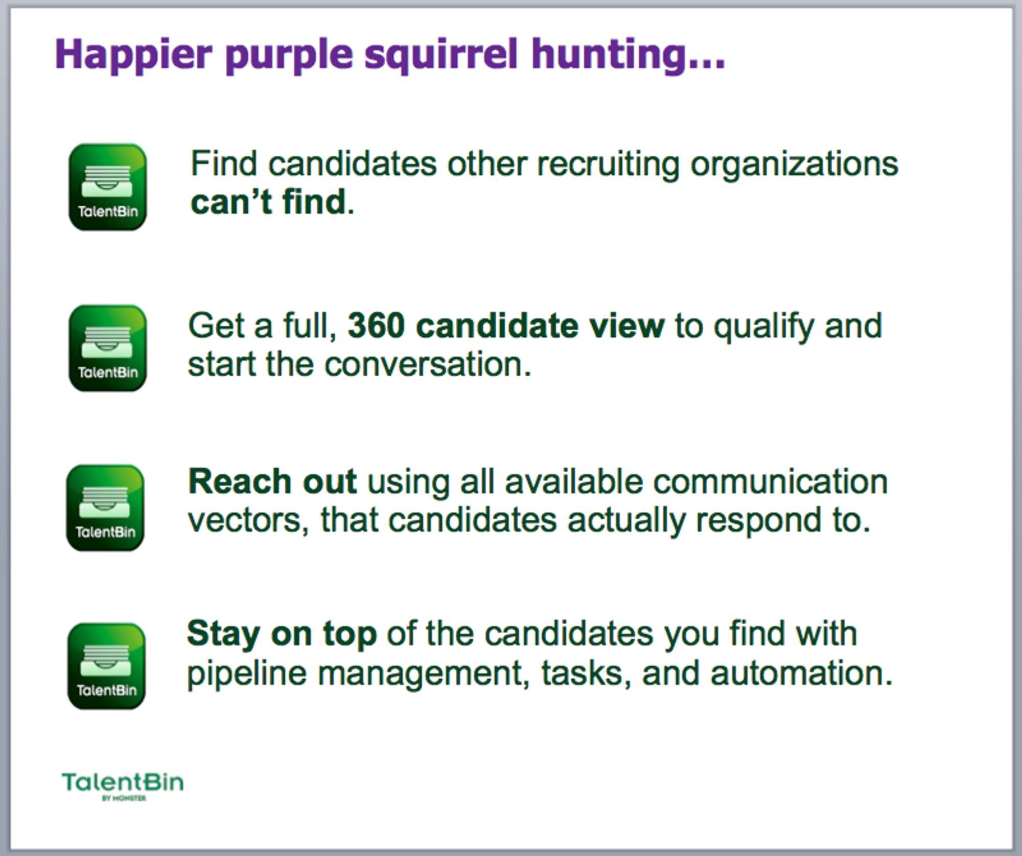
Your “minimum viable product” is literally a slide on each of these steps, with bullet points spelling out the elements of your narrative. Now, that wouldn’t be very sexy — but remember, like your narrative, and your product itself, this will always be a work in progress, getting better and more involved with each iteration. It’s okay to start simple. Here’s an example of a starter solution slide:
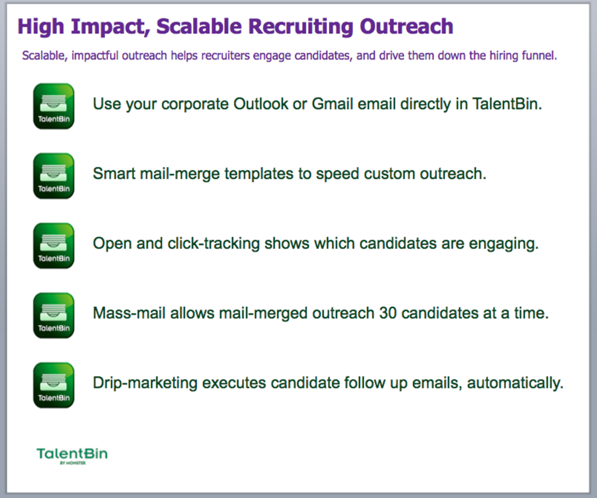
As your bare-bones solution section evolves, it can be broken into “sub-chapters” by adding a single slide on each major value proposition. For instance, one of TalentBin’s value props is “Scalable, impactful outreach that helps recruiters engage with candidates and drive them down the hiring funnel.” The corresponding slide speaks to how TalentBin enables recruiters to:
- Integrate their existing email systems with the product.
- Use mail-merge templates to quickly send email through that integrated email system.
- Leverage open and click tracking in those emails to see who’s interacting with their messages and who’s ignoring them.
- Send up to 30 messages at once through a mass-mail system.
- Implement drip marketing to would-be job candidates with campaigns that send follow-up emails without any additional recruiter effort.
In our deck, this “sub-chapter” looked like this:
Imagine doing this for each of your product’s value propositions. Each slide should include the features that speak to a key selling point, bulleted out, perhaps with a small screenshot or icon signifying each. Now, rather than a single solution slide, you have a top-level overview and several focused slides with the next level of detail on each value prop. Evolving your deck this way will allow you to speak to key features — or, if sent as a stand-alone document, encourage your customer to review and understand how these features support your value proposition.
Later, when you want to go to the next level of detail, you can create a dedicated slide for each of the bullet points on those slides. To help the user buy into the value of key features, dedicate a slide to each one with screenshots and subtitles that offer a more detailed explanation and supporting metrics. That said, never throw away summary versions of these sections. You’ll want them later so you can choose the level of granularity you use in a given presentation and appropriately tailor it for customers, press, analysts, investors, or what have you.
How would you bucket your solution? What features would you drop into each bucket? And how would you describe the value of those features in a slide? Take a second to think about what this looks like for your product.
Now imagine this approach applied across the rest of your slide deck, not just in your “solution” section. Start with the minimum viable coverage of each piece of your narrative, and then build from there as appropriate. A helpful metaphor is “zoom in, zoom out.” Start at a higher level, and if you want to “zoom in” on a section, build more slides for it. The important thing is to have at least a broad version of your end-to-end narrative that can handle those cases we talked about — speaking over the slides during an online presentation, sending them to someone, etc.
PRODUCTION VALUE
Since we’re on the topic of producing minimally viable products to start, let’s talk about production value. As with all things startup, it’s critical that you not wait to have “big company” materials before you get started. Even the starkest slides with no branding or polish, when loaded with impactful, persuasive content that presents a transformative, innovative product, will close business.
Never let your belief that “it’s not flashy enough” block your ability to create content.
This isn't to say that you can't add flash later, but it should never be viewed as a roadblock. Also, flash without a valid narrative is actually worse than nothing — you just look like an idiot with nothing to say who wastes people's time.
All that said, there are some basics that, with minimal effort, can help boost your production value in a way that bolsters your messaging. For instance, a simple slide template with background coloring, font theme coloring (that is, headline text of a certain color, smaller subtitle text of a different color, all correlated to your brand coloring), and your logo in a bottom corner can easily spruce things up. Conveniently, a lot of this stuff may already be built for your fundraising materials. If you have a slide deck with a theme, logos, and so on that was used for raising money for the company, just steal that, and iterate on it.
Be sure to include title slides in your template — that is, full-stop slides to define a new section of your presentation (even if that’s just “Demo!” or “Appendix”). And as you progress, have a “templating” mindset. If you create a new type of slide — like one that shows images of features along with subtitles to support a value proposition — make sure that you clone it as you’re making new versions of that slide for other value props.
There are other pretty basic things you can do to help with your production value in a minimally viable way. Drop shadows on screenshots to make them pop out. Use tools like Camtasia to take videos of certain use cases and make them into animated GIFs for inclusion in the deck — in effect adding mini demos to the relevant slides. Pay attention to information architecture too, by varying text size and formatting like bolding and italics to put emphasis on more important things, and diminish less important things (like subtitles on screenshots, footnotes, etc.).
But remember, the best production value in the world can’t dress up a story that doesn’t hit the business pains of your audience and present how your solution is positioned to solve those pains. So nail that first.
DECK MANAGEMENT
As you create your deck — starting with the minimally viable slide-based version of your narrative, and then extending out as you embellish various sections — you’re going to need to pay attention to “bootstrap content management.” As more and more content is produced, the best way I’ve found to manage it is in a single large slide deck that lives on the computer (or in a Dropbox/Google Drive folder) of the person responsible for its creation, editing, and extension. For instance, I started a “TalentBin Sales Master_tip_of_the_branch.pptx” file at the company’s inception, then expanded and refactored it every step of the way.
This shouldn’t be the deck you present to customers — with all 120 or so slides covering every possible angle of the product and market. It’s simply the repository from which you’ll produce sales-ready versions of the deck, or even press-centric versions, analyst-centric versions, and more. Every time I make edits, I like to fork off a copy of the deck and save it to whatever content-sharing mechanism my team is using (whether it’s ClearSlide, or even just Google Drive, Dropbox, or SharePoint).
This way, nothing is ever destroyed, even as you extend and refactor, and you’ll still have a record of all prior slides, even if they’ve been dropped from the master as no longer necessary. And importantly, later, when you have dozens of sales reps using your materials, separating the master from a version that has been pushed out to “production” on ClearSlide is also important, so that you don’t have others hacking at your canonical deck.
It’s far from elegant, but until we have GitHub for PowerPoint, it’s the best approach I’ve found. Building a master slide deck will ensure that you’re not reinventing the wheel, and that the totality of slides that could be used to tell your sales story are always ready to be deployed or remixed.
CUSTOMIZATION
A sales presentation is focused on identifying each individual customer’s pain points (via discovery questions and pre-call planning) and presenting your product as the solution to those pain points. Nothing does that better than using specific, tailored customer information in your sales presentation (and later, your demo) to help show that prospect exactly what your solution could do for them and what it would look like in practice.
If your offering is web-based, then good examples of this could be screenshots of your solution working on a prospect’s website or facing their particular customers.
For instance, I’ve worked with a talented group of guys who run a startup called LifeGuides, which helps companies create awesome employee-focused recruitment branding materials at scale. They then make sure those materials rank high in Google search results for “working at [your company name],” and that those materials can be deployed in all manner of recruitment marketing tools. Their sales deck is set up such that they can drop in Google search results for “working at [prospect company name]” to demonstrate to the prospect what recruiting candidates will actually see when Googling their company. And they have even more slides set up to show what a prospect’s career site could look like with LifeGuides-style content deployed.
All it takes is a little templating and clever screenshotting to make a world of difference in how clearly you communicate your value to a prospect.
SECTIONING YOUR DECK
While you’ll iterate your slide deck continually, in alignment with your sales narrative and feedback from the market, there are some things to watch out for in a few sections.
The Problem and Who Has It
Starting with the “problem” section is helpful to your sales deck in the same way it helps kick off your larger sales narrative: If the person to whom you’re presenting, when shown the problem your solution addresses, says, “Huh, I actually don’t have that problem,” then delightful! You’ve saved yourself and them the trouble of presenting a solution that isn’t a fit.
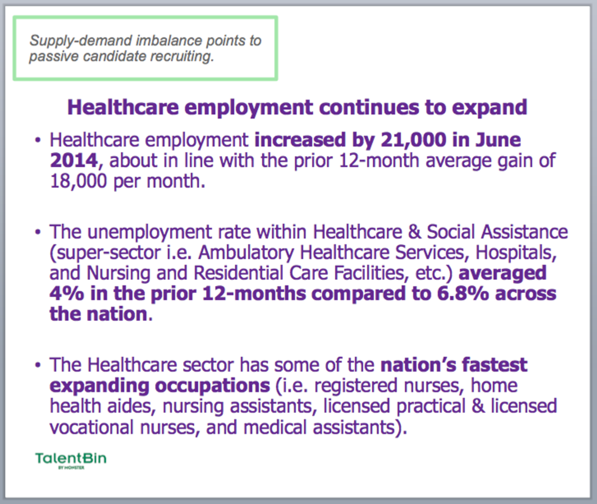
This section of your deck is a great place to document not just the problem that you’re seeking to resolve, but also other validators of that problem and its importance. This could be things like stats from industry analysts — e.g., for TalentBin, these slides address the extremely low unemployment rate of technical, creative, and healthcare talent — press clippings, and so forth. That way, you’re not only describing the problem in more depth, but also showing that many others agree that it is a problem. For example, this is a “problem statement” slide made when TalentBin was first getting into the healthcare space. The slide documents the pain that recruiters trying to hire doctors and nurses have in a low-unemployment environment:
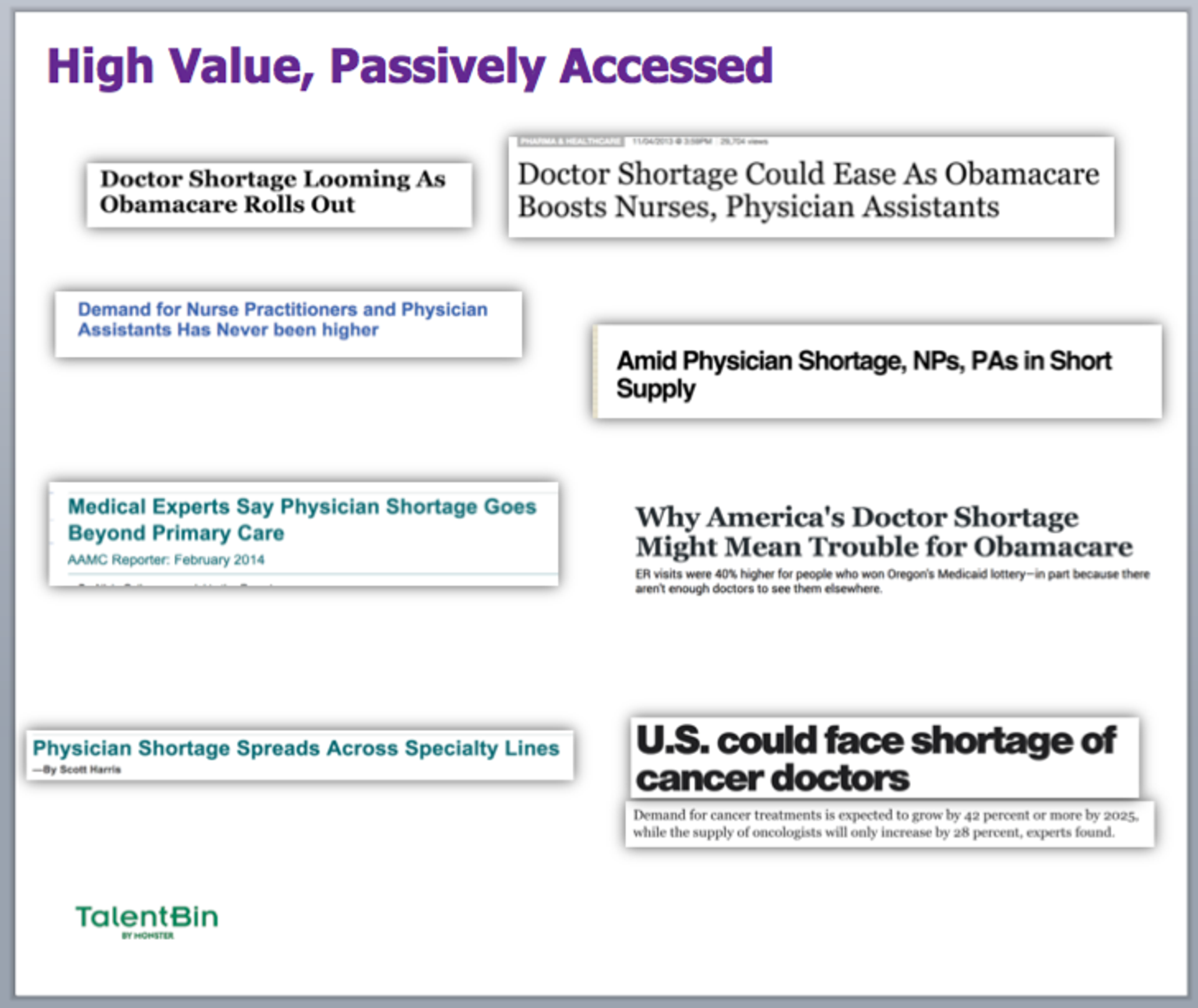
This can be done via “anecdata” as well:
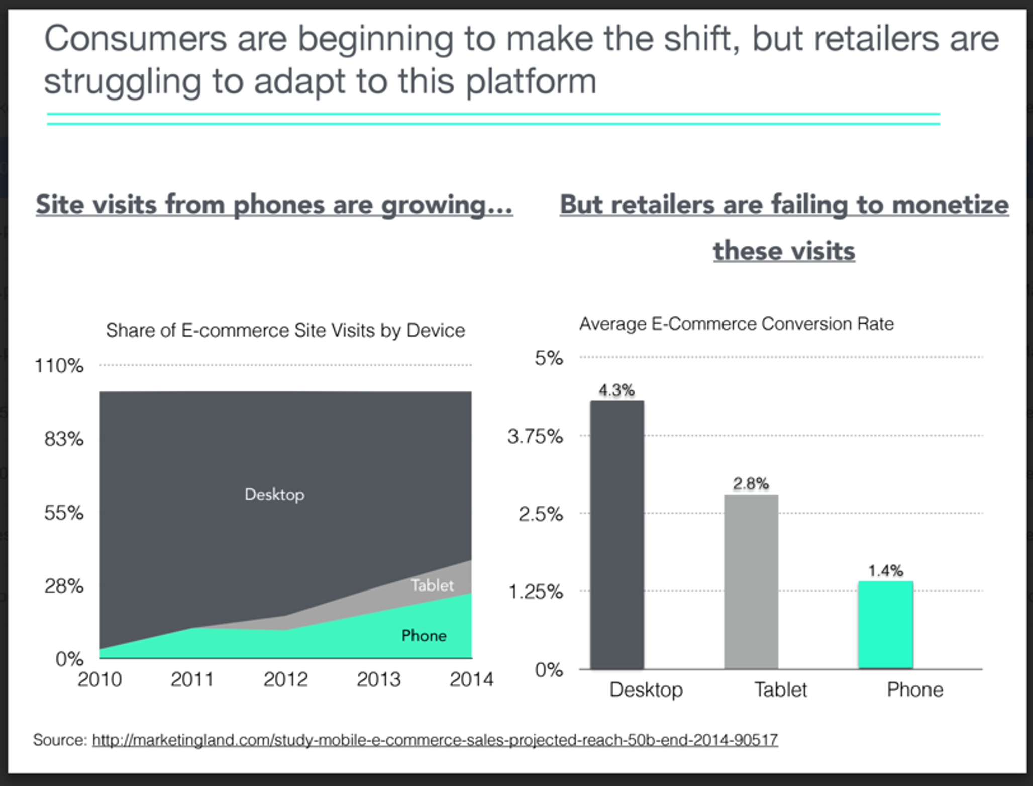
As another example, this is a good slide demonstrating the problem case that e-commerce providers face in the poor conversion rates of mobile shopping:
Cost of the Problem
The cost section is another great place to underscore the problems suffered by your target audience — and how much they’re costing. Again, this is a good time to trot out validated metrics from studies, analysts, press, etc., and to generally prove the case that the problem in question is creating business issues for people like your prospect.
For a sales CRM solution, you might highlight the opportunity cost of lost deals on a per-rep basis. Or how increased sales rep efficiency can add additional deals per rep, per month, and that without proper CRM software, your organization is missing out on those deals. Or how missed forecasts injure the ability of an organization to plan properly, and can get a company into financial hot water.
With each of these statements, it’s best to append metrics that show at least a directional notion of the actual dollars-and-cents cost of these problems, ideally in a way that can be applied to the business you’re addressing. That might look like $X cost per rep, per month. Or $Y cost per manager, per month. Z deals per month not won, which, with your average contract value, would be $A per month in foregone revenue and, with your fifty sales reps, adds up to $50 x A per month in foregone revenue. Make it easy to understand the ongoing cost the prospect is sacrificing by not working with you.
Existing Solutions and Their Challenges
Slides on existing solutions are a bit of a tightrope walk. On the one hand, it’s a good idea to stay away from talking about your competition unless prospects bring it up themselves, so baking that into the core of your presentation can be dicey. However, in the case where existing solutions are pervasive — and if you’re selling a new, upstart solution, there will generally be “market standards” that everyone is familiar with — then it can be helpful to address them directly. It helps you take control of framing how you’re different from the existing solutions, what their shortcomings are, and how you overcome those.
At a minimum, this should be a single slide that groups existing solutions into buckets so you can address how you are not like them in easy to visual ways. In the case of TalentBin, traditional solutions include job postings on boards like Monster.com or CareerBuilder, resume search in resume search databases from, again, traditional job boards, talent search on professional networks like LinkedIn, etc.
If there’s a solution or set of solutions that the majority of your prospects will be comparing you to (or you would like to be compared to), then you can dig into that. As a passive-candidate search engine and recruiting CRM offering, TalentBin was an upstart competitor to LinkedIn, and their Talent Solutions offerings (namely, their flagship “LinkedIn Recruiter” product). More than 80% of the prospects that we spoke with were probably using it already, and that was actually a good thing. It demonstrated that the customer was already familiar with passive-candidate recruiting and was willing to spend money on it.
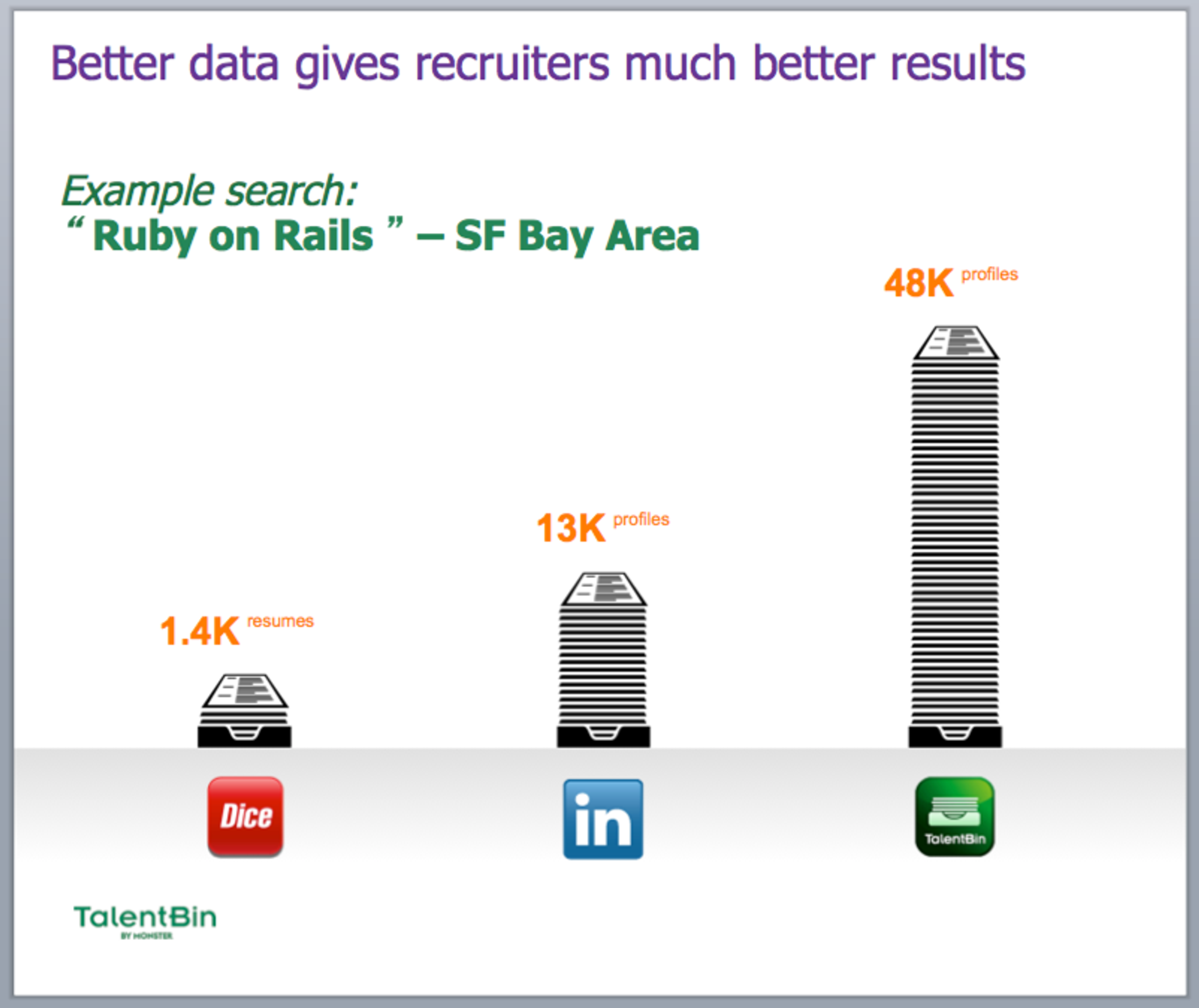
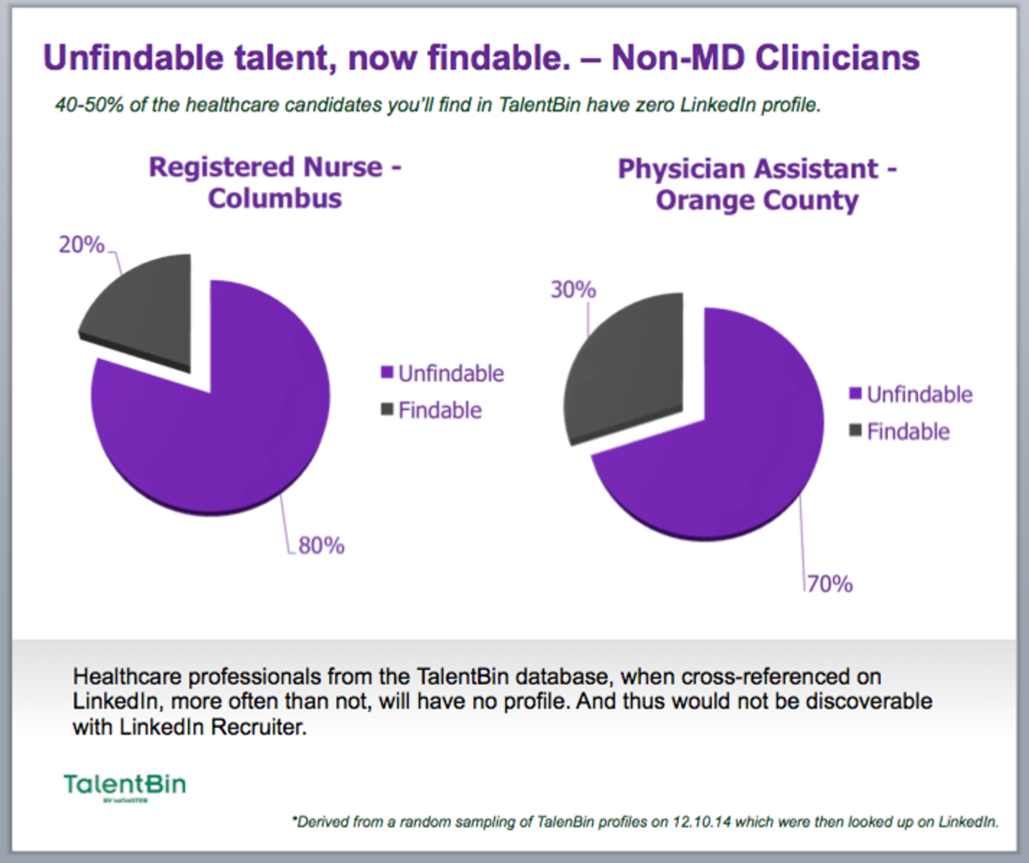
So, our deck had a couple slides on the particular challenges of LinkedIn Recruiter and broke them down into categories: “Discovery,” “Qualification,” “Outreach,” and “Pipeline Management.” Take the issues LinkedIn Recruiter has around discovery: Software engineering, design, and healthcare talent often does a poor job of even having LinkedIn profiles, and certainly of embellishing them with proper skill information. As such, those profiles can’t be found by searching on LinkedIn Recruiter. This is a problem for recruiters, as demonstrated by the sparse results that come from a search for a particularly valuable skill or title like “iOS development” or “nurse anesthetists.”
Moreover, because of the hundreds of thousands of recruiters using LinkedIn Recruiter, outreach to candidates via InMail is a decreasingly effective means of engagement, as demonstrated by the number of InMails technical candidates get weekly, and declining response rates. These points, of course, correlate to key value metrics that clients are familiar with.
Here are some examples from the TalentBin sales deck:
Characterizing the root cause of the challenges faced by the industry standard (in this case LinkedIn)
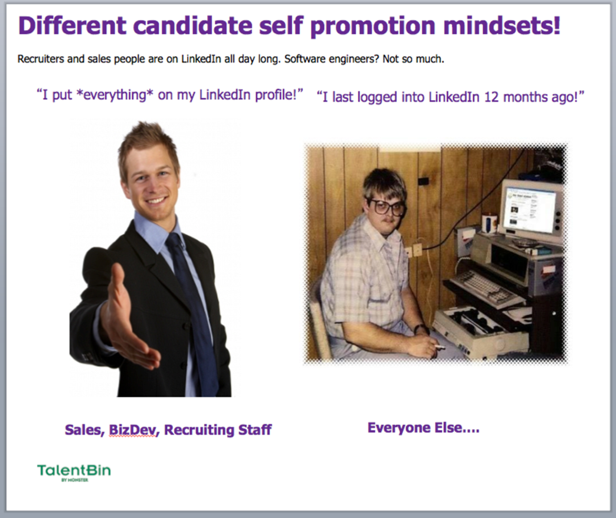
Proof of what this challenge looks like in the real world
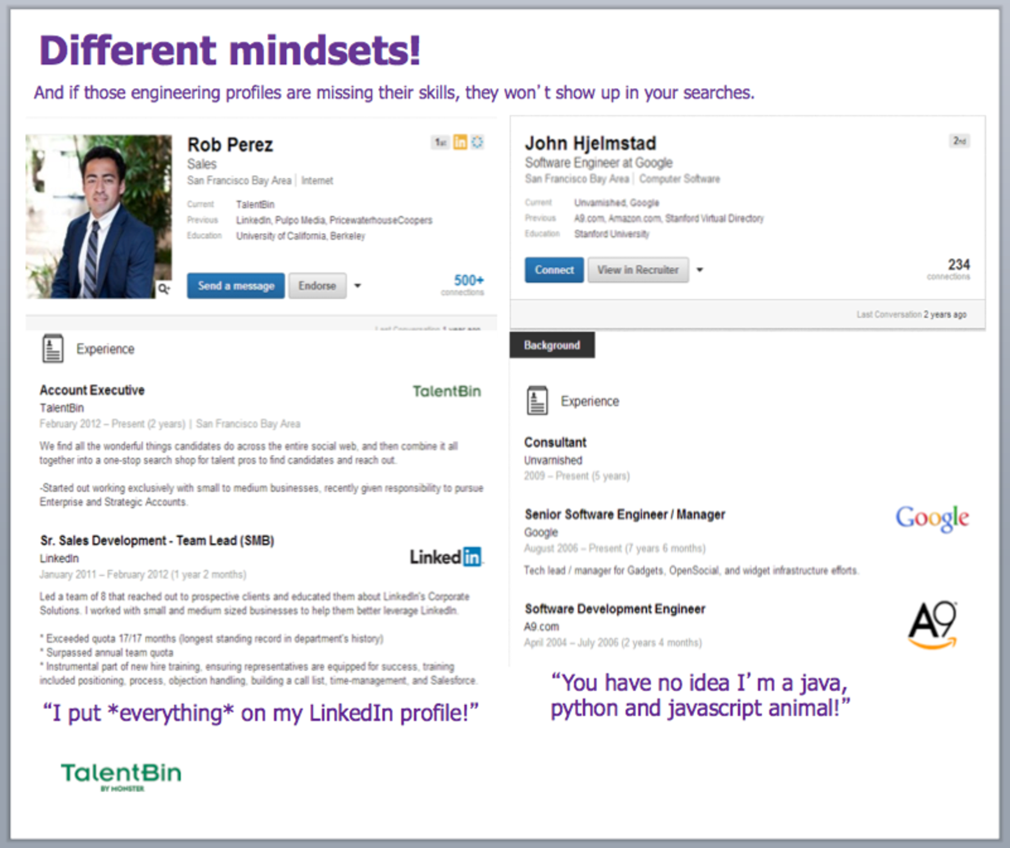
The extension of this challenge at scale
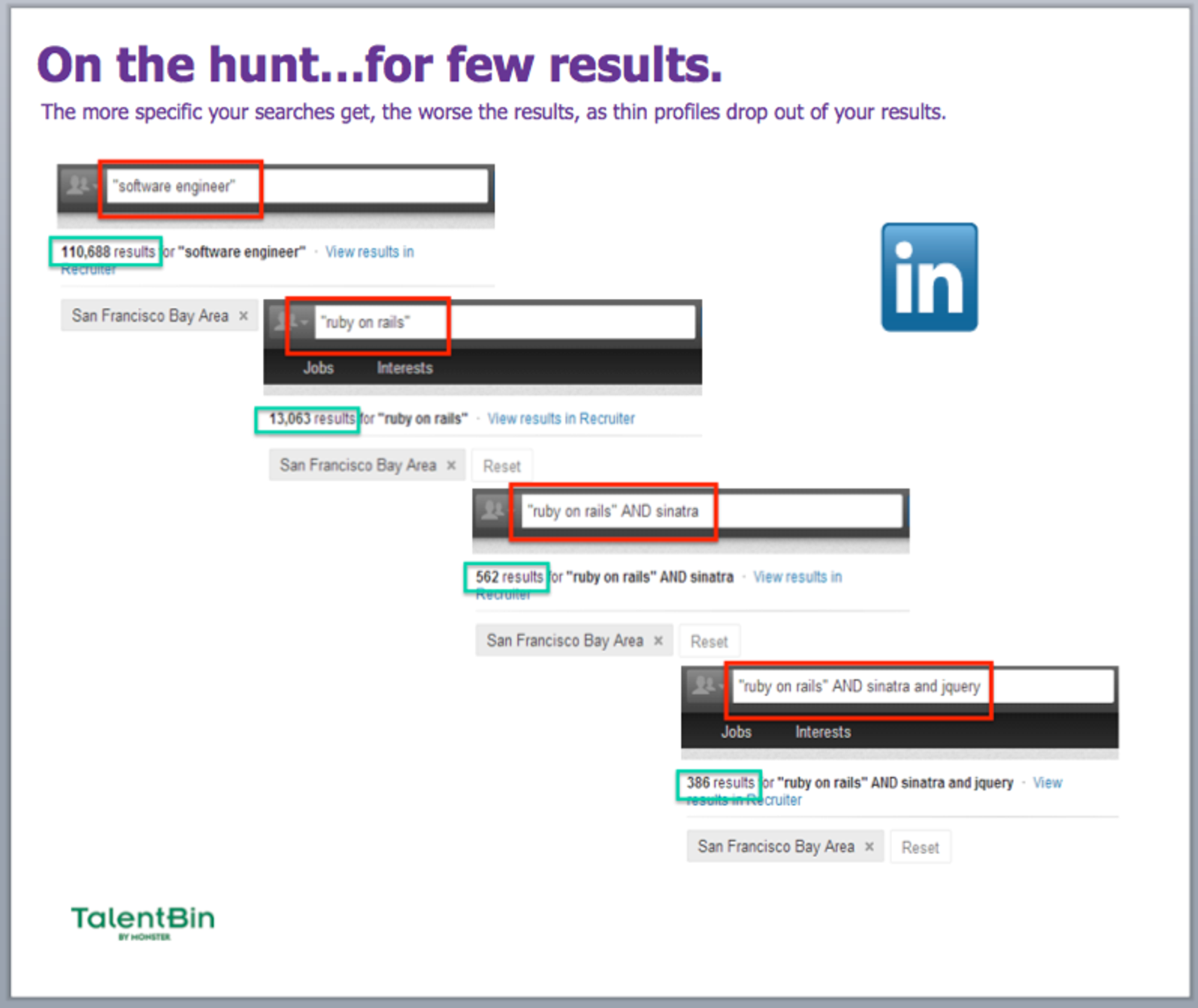
Further implications of this core challenge
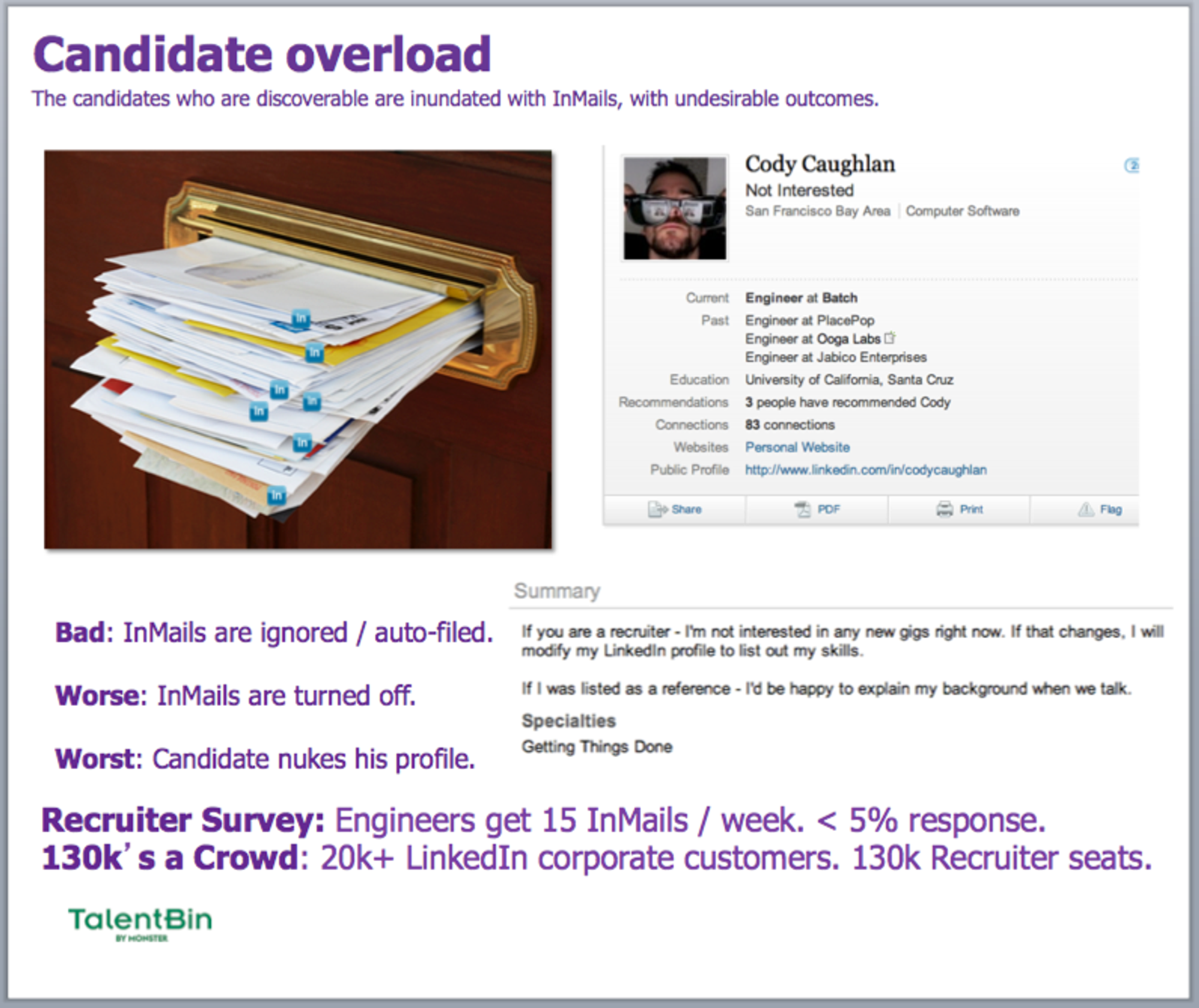
A summarization of these unit pains at a macro scale
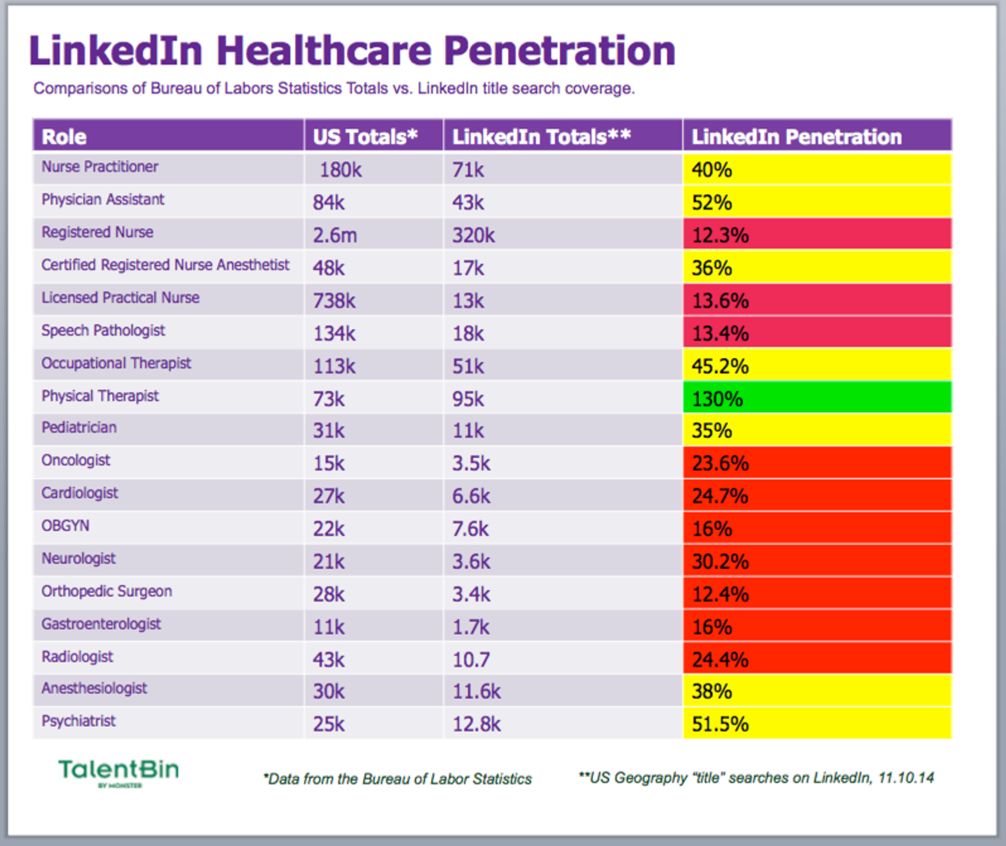
Including at least some slides to frame your solution in contrast to existing solutions will be helpful in demonstrating why your product is so much better and worth the investment.
What’s Changed
The worst sales meeting? It’s the one where the client actually has no clue what’s being discussed but, because he doesn’t want to admit it, just politely nods along, commits to “follow up,” and promptly disappears.
The best way to prevent this is to include a section in your deck on what has changed in the market, how it impacts clients, and creates opportunity for your solution. As you walk through it, with the help of a visual, you can check in on comprehension and agreement, and confirm that the prospect is actually, indeed, following along (and ideally getting more and more interested).
For instance, TalentBin’s deck looks at how the process of finding talent online has changed, plotted on a timeline. This allows a quick (not deep!) understanding of what searching for talent was like before. As you go through your version of this catch-up slide, you can make sure that the client is following you and is familiar with the market and the technology changes that have driven this new opportunity. If they are, fantastic! Applaud them for being students of the game, and move on. If they are not, dig in and make sure that they are onboard with the required contextual information before progressing. Either way, you’re guaranteed to avoid a scenario where prospects tune out and start checking their email.
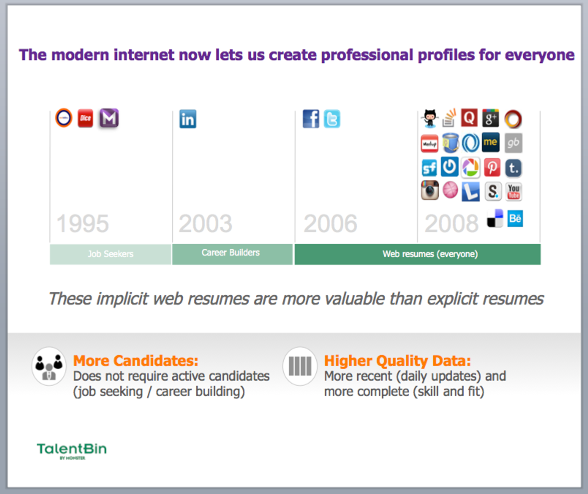
How Your Solution Works
I find it key to include a conceptual visualization of how your solution works — to clearly establish the correct understanding — even before you get into specific pain points and their associated solutions.
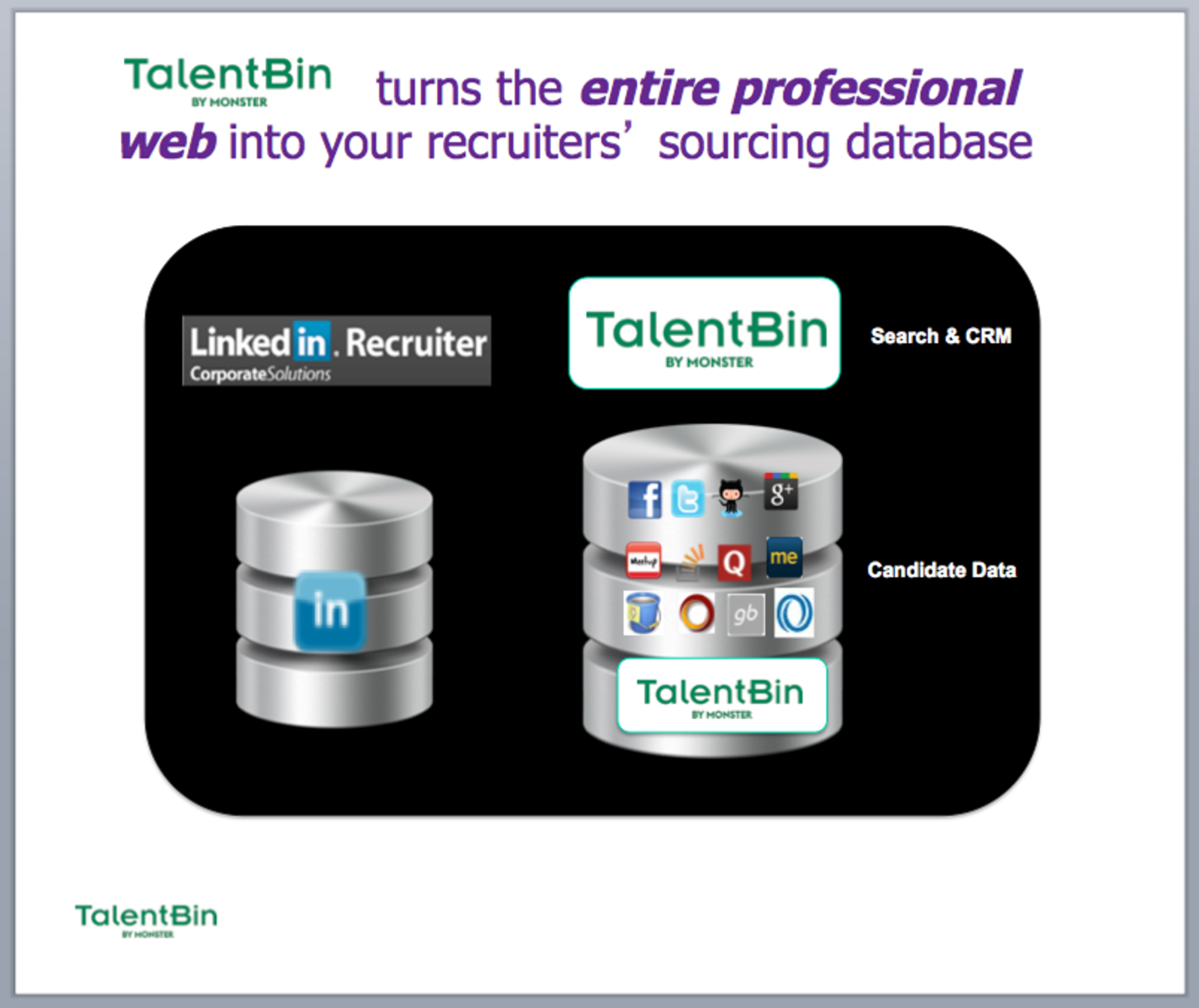
Because so much of TalentBin’s functionality flows from the aggregation of candidate profile data from across the web into a unified profile, it was very important for us to ensure prospects comprehended how that process worked, or else they would have difficulty understanding anything else.
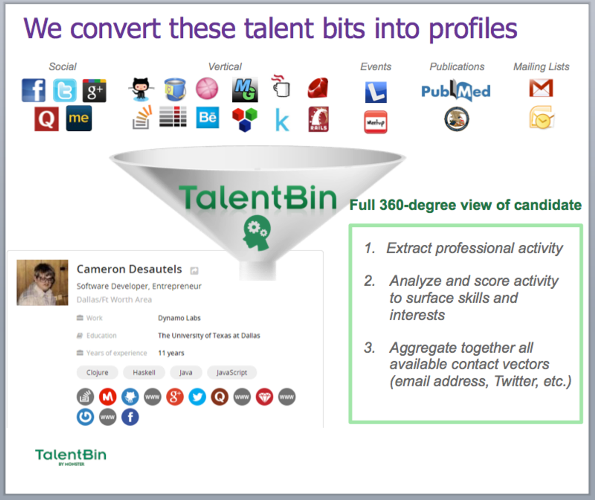
Another way to help structure this high-level understanding is in contrast to other solutions in the market.
Because most recruiters are well aware of LinkedIn’s recruiting tools, especially LinkedIn Recruiter, articulating that TalentBin is a recruiter-facing talent search engine and recruiting CRM like LinkedIn Recruiter — but where the database is the entire Internet — really hits home for clients.
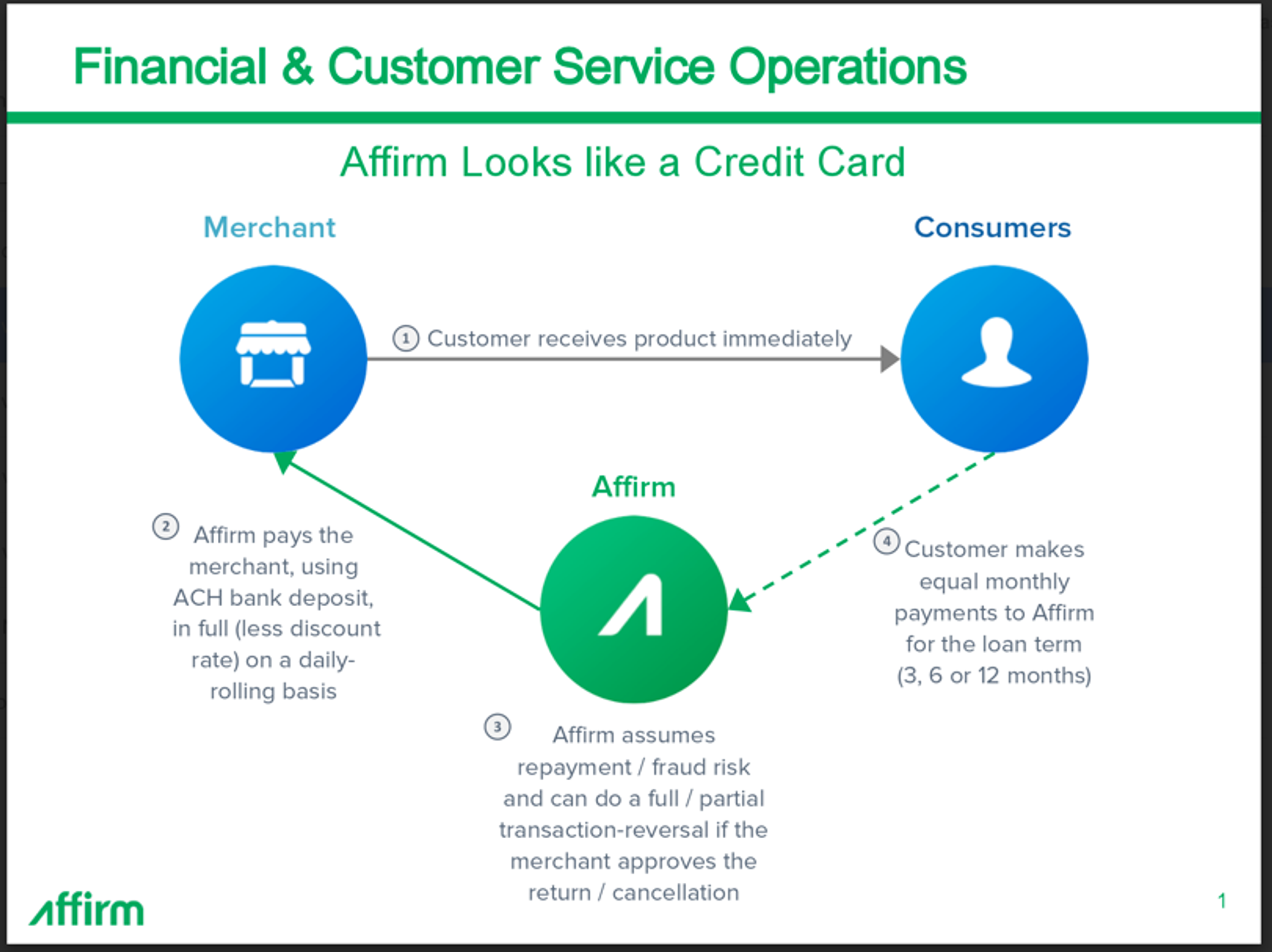
Here’s the “how it works” slide from the consumer finance company Affirm showing how they work with e-commerce merchant partners, and how the payment flows work. Rather than hoping that the prospect understands the verbal articulation of these concepts, a nice diagram really nails the core concepts.
Quantitative/Qualitative Proof of a Better Solution
Once you’ve made the case that existing solutions have problems — and that there are real opportunity costs if they remain unsolved — the next step is presenting proof of your superior solution. If you do a good job, you’ll make adoption of your solution look like a complete no-brainer by comparison. This should be done both quantitatively and qualitatively. But the ultimate goal is to answer one question: “Why you?”
When building your argument, I like to have proof of superiority bucketed by value proposition. In your narrative, you keyed in on specific metrics that prospects track to gauge business success — this is where you can demonstrate how your solution impacts those relevant metrics.
This is also where you build your case for “why now?” The biggest challenge faced by founders selling young products is motivating any change at all. This is why you have to demonstrate a large cost or opportunity cost that the prospect is encountering every day that he doesn’t adopt your solution. These slides are the ones that really bring this point home.
Quantitative Proof: Again, extensibility is key here. You can share the most basic proof of superiority for a set of key metrics in a single slide, or you can go deeper on each section. The goal is for customers to look at this information and agree that your solution, as measured along a particular value vector, is far superior to their status quo.
Some examples from the TalentBin deck:
Superior search results compared to industry standards
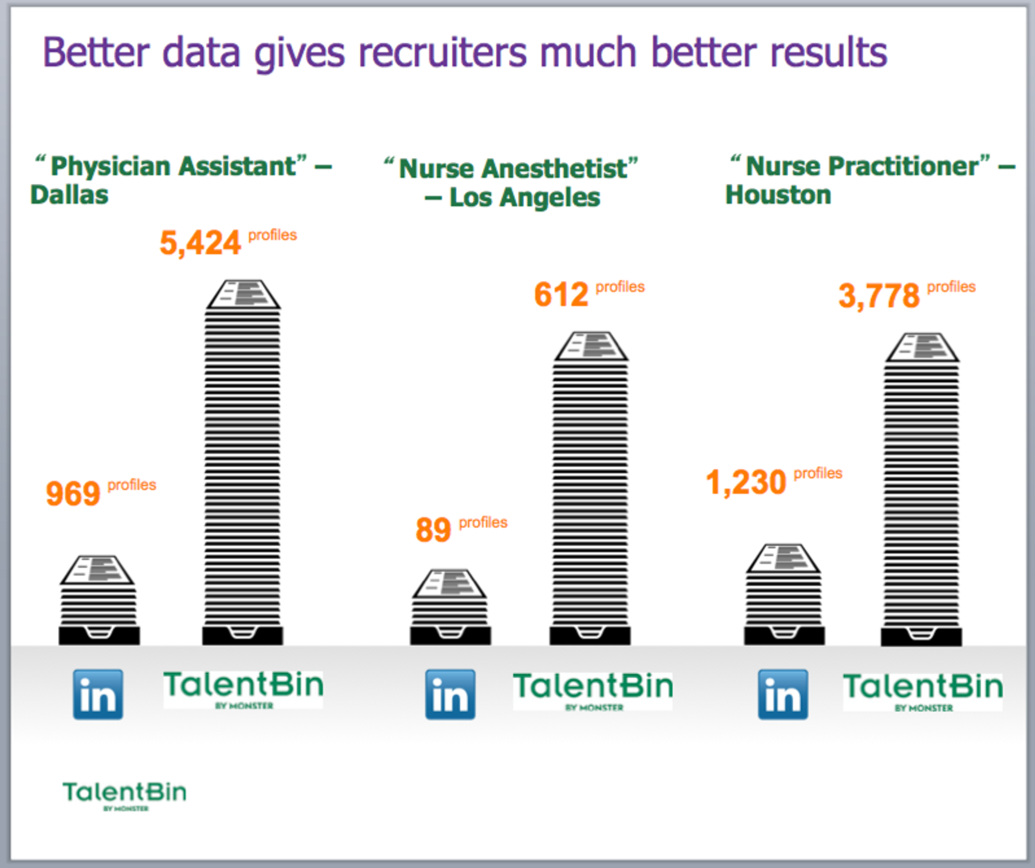
Profile availability compared to industry standards
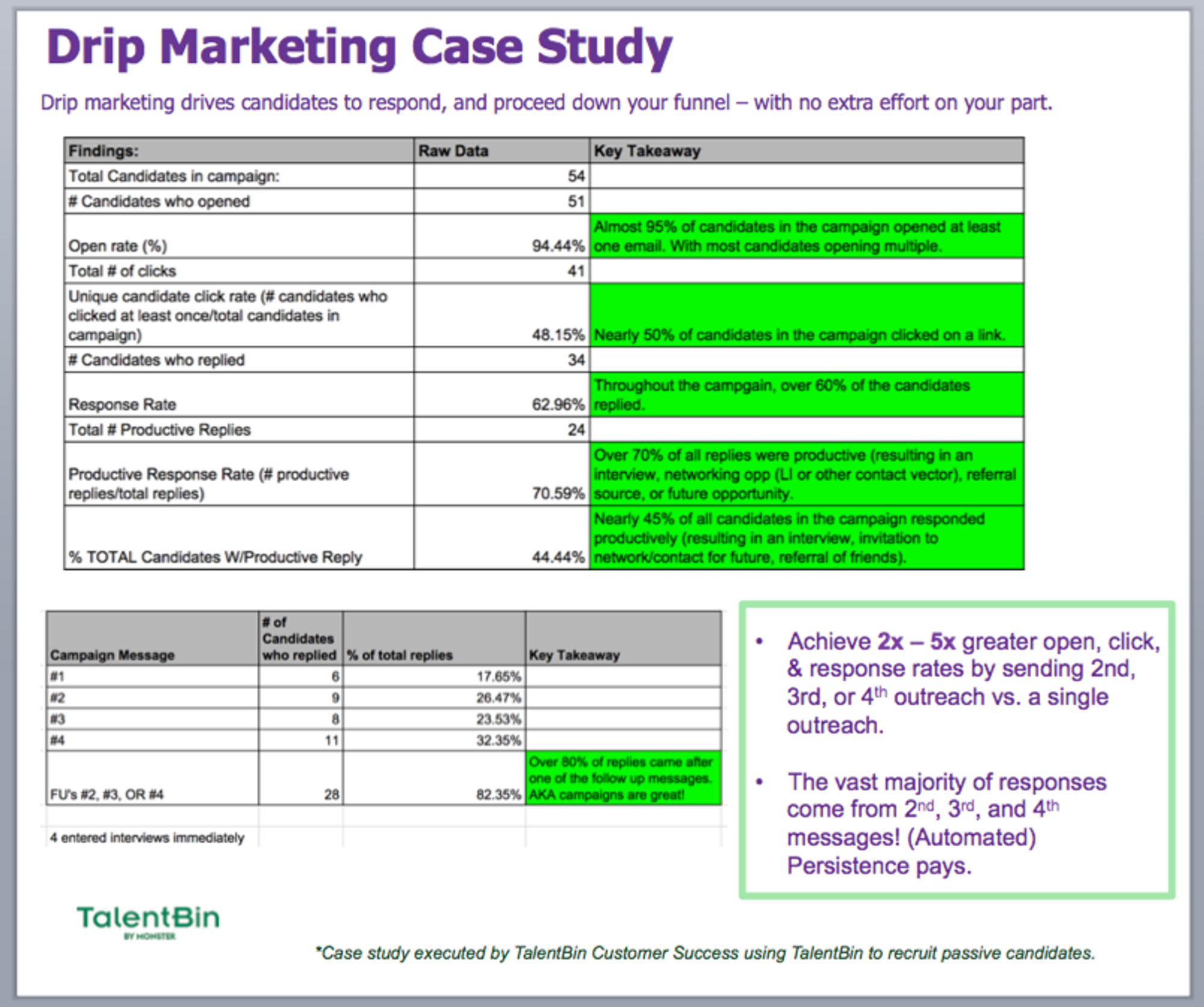
Enhanced candidate responsiveness via drip-marketing functionality (contrasted to opportunity cost of “one-and-done” candidate outreach)
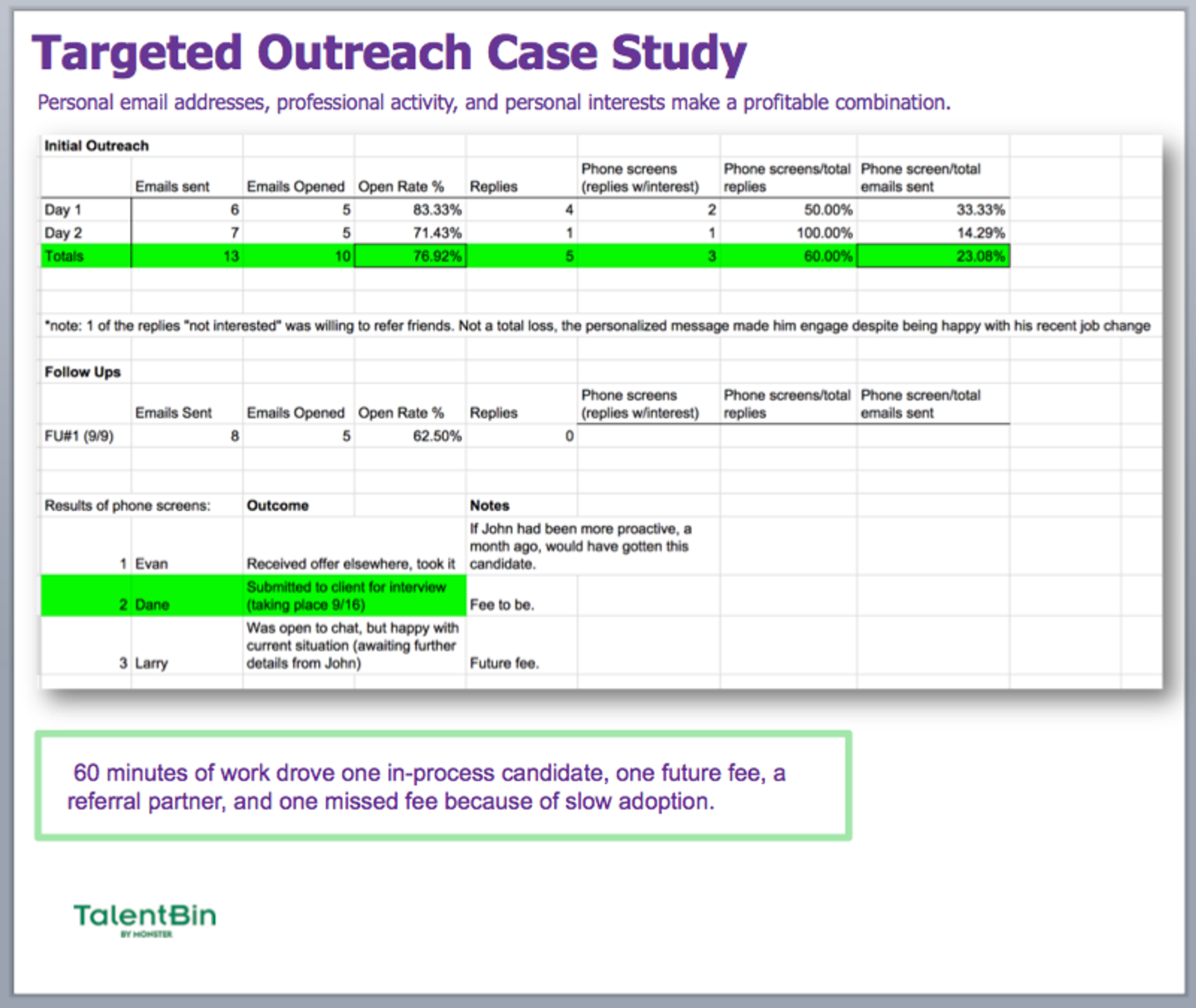
Enhanced candidate responsiveness via superior targeting and email content (contrasted to InMailing, generic messaging)
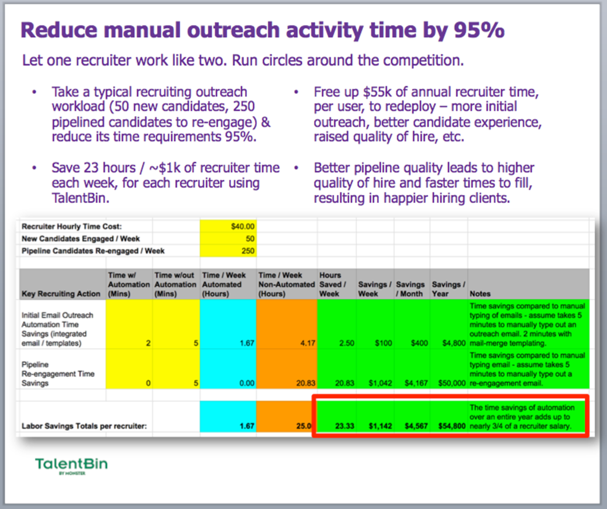
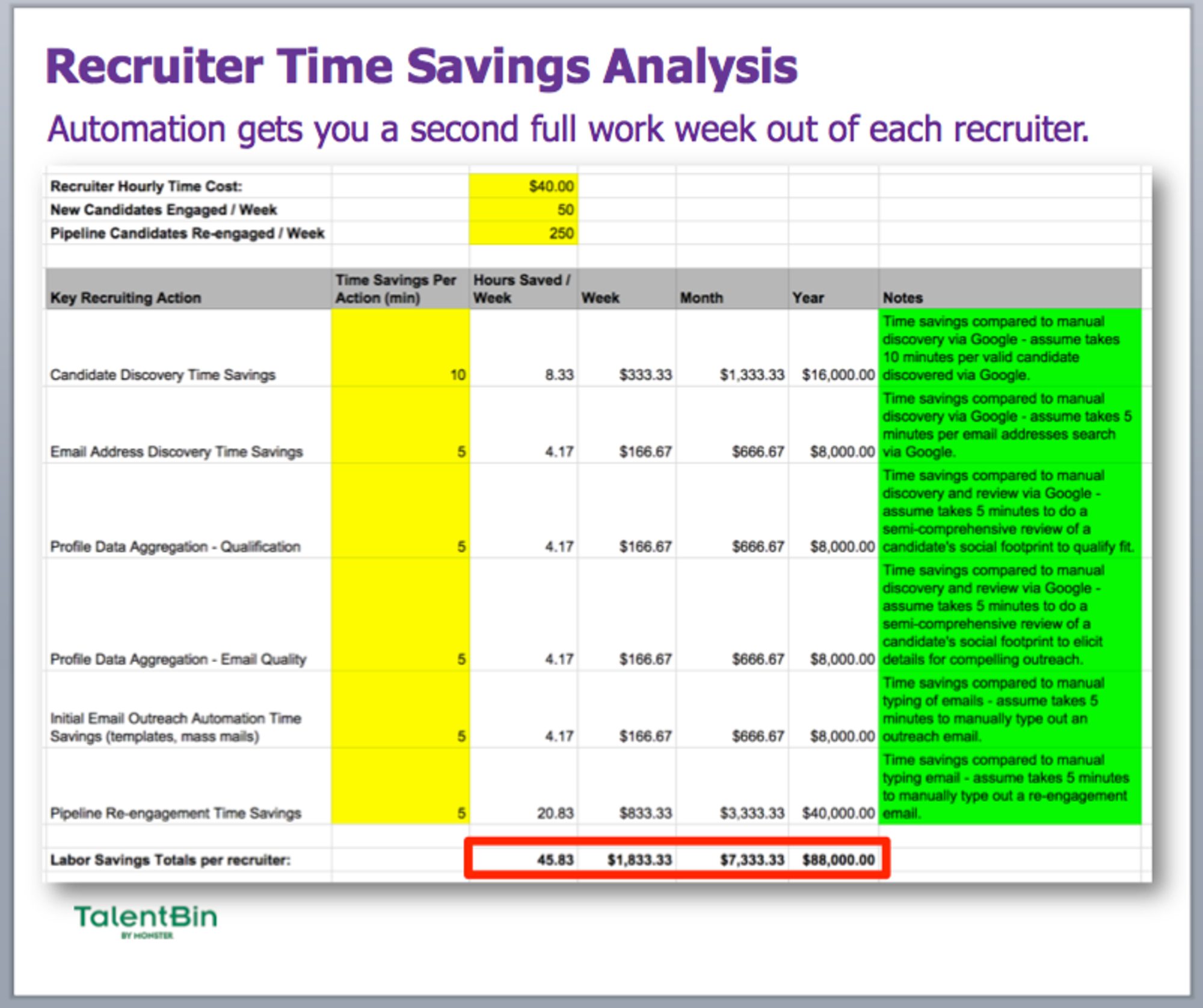
Recruiter time savings via automation (contrasted to time cost of “proper” recruiting follow-up behavior without automation)
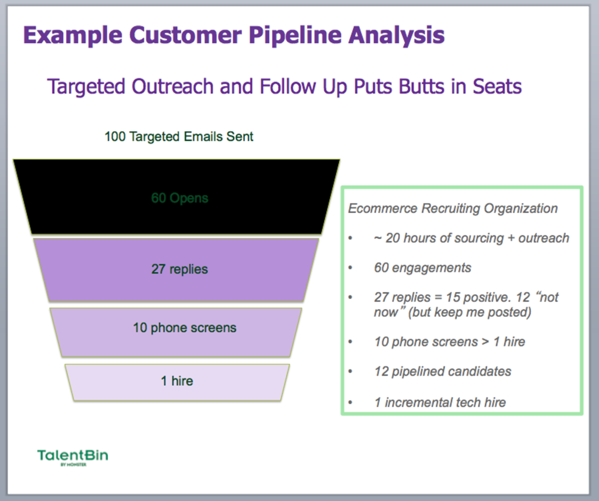
Prototypical customer hiring funnel driven by TalentBin best practices (contrasted to a LinkedIn InMail–driven funnel)
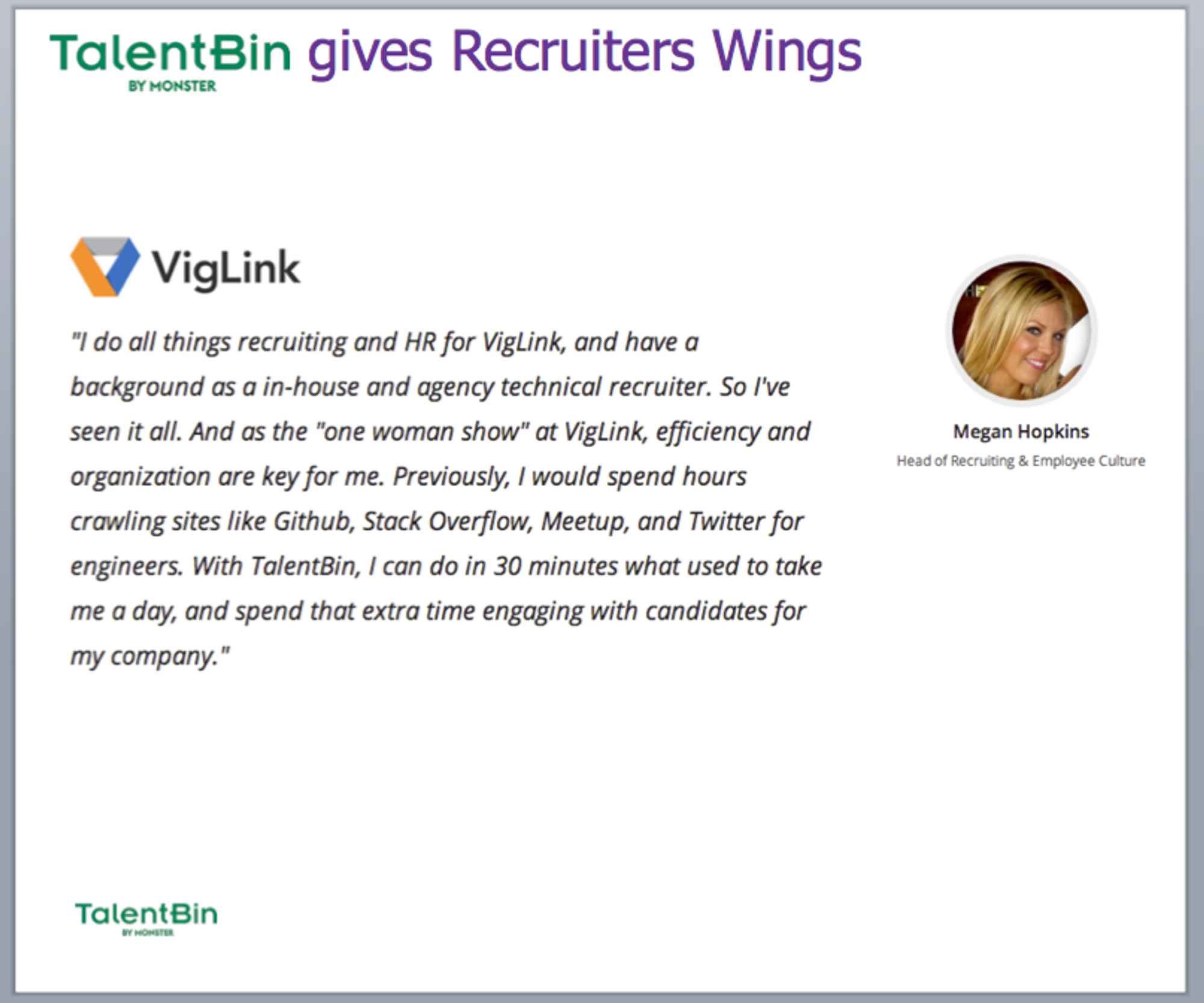
Qualitative Proof: While quantitative proof is usually the most impactful for B2B sales cycles, qualitative proof points can be helpful as well — and together, they make for an excellent one-two punch. Like with quantitative proof points, they should correlate to your value proposition buckets. The best way to do this is to have good relationships with some early customers and offer to write testimonials for them; then all they have to do is approve them.
Customer success example of a “one-woman show,” focused on time-savings benefits
Company-Centric Proof Points: You can also throw in company-centric signifiers of why your solution is superior—perhaps because it has been covered by third-party reputation providers, like press or analysts.
This example of a “why we are legit” slide is less about “aren’t we hot?” and instead says, “See, you will be in good company when you partner with us, and we will be around for the long term.”
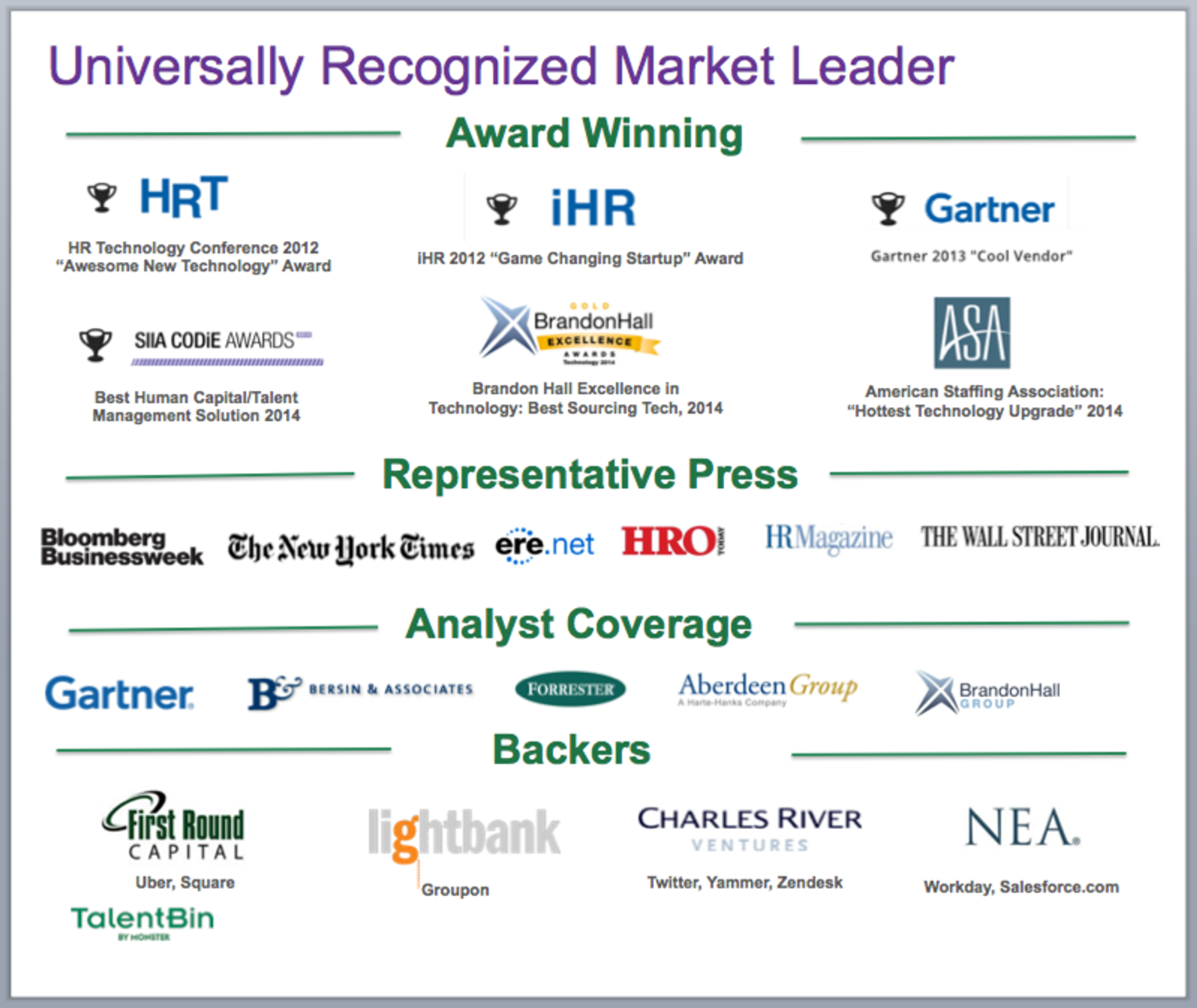
Many companies use a “logos” slide for this purpose. If you go that route, make sure to include examples of all the segments that you care about. In TalentBin’s case that was small to large business, and both commercial enterprises and staffing agencies.
The goal is for the prospect to look at this list and say, “Ah, I see others like me. And I see others whom I aspire to be.”
Pricing
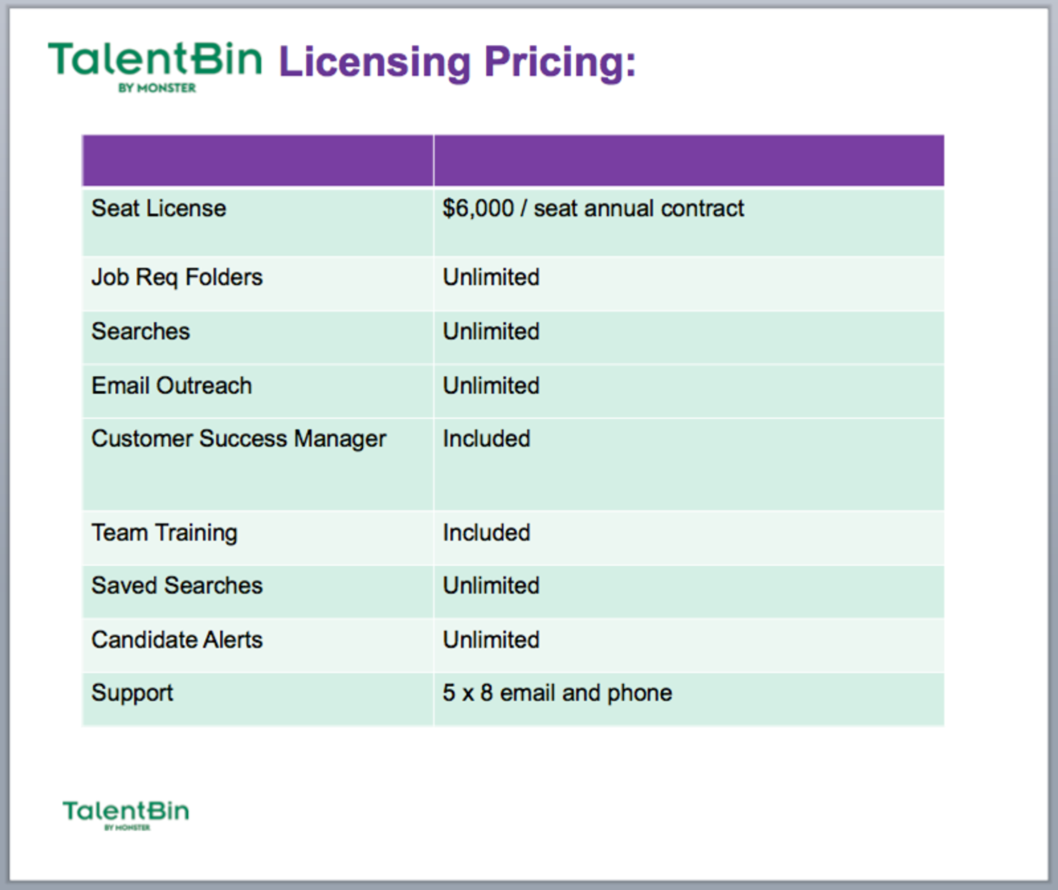
Eventually your prospects are going to want to talk financials. Having a slide that presents your solution’s pricing and any potential variations helps here, and also helps for when you send your slides along later for reference by the client.
Appendix Sections
It’s imperative that your core presentation doesn’t spend time on the unnecessary or superfluous. For instance, if your solution integrates with a particular piece of software that only 10% of your customers use and you’ve decided to have a slide on it, don’t include it in your main deck. Put it in the appendix. Have a specific slide comparing your solution and a competing one that doesn’t need to be addressed with everyone? Don’t bring up the competition unless asked. Put it in the appendix. When the customer says, “So, how do you compare to XYZ?”—boom, you can flip right to it. But it won’t be in the main presentation to cruft things up and drain attention from your essential points.
As you execute more presentations, you’ll invariably find new cases that need their own appendix slides.
I generally try to add an appendix slide anytime I hear a question asked for a second time.
It’s a 30-minute investment, and you know that at scale (doing dozens of these demos) you’re going to hear that question a lot. Having a slide with the relevant messaging at the ready ensures that you nail that response, and impress the heck out of the prospect.
Deck for Presenting, Deck for Sending
When you’re putting your deck together, remember that there’s the one you present (along with an appendix that you pop into as necessary), and then there’s the one that you’ll send after your conversation. They should be different. This is where content management and presentation solutions like ClearSlide can be helpful. You can have your “full-on” deck that you use for your live presentation, and an abridged version to send along after the fact.
When you’re thinking about the one that you send, it can -- and usually should -- be a pretty heavily abridged version of your main presentation deck. A deck sent after the fact is not a substitute for incremental presentations to other stakeholders, but rather a reminder of the key topics that were covered. It can also be a teaser for other potential stakeholders with whom it gets shared, in the interest of driving further presentations. Moreover, sending your materials using something like DocSend or ClearSlide will allow you to see prospects’ interaction with your materials, something that’s helpful in distinguishing between those who have more commercial interest and intent than others. For instance, did they spend time on the pricing slide? Did they send it to a bunch of other people who reviewed it? This is all incredibly valuable data to have.
Equipping yourself with a smart deck is the biggest and best step you can take toward having a solid — and most importantly, scalable — sales strategy. It’ll give you the messaging you need to make a strong argument and continually iterate. Combined with irresistible outreach templates and a prospect-focused demo, you should have no problem getting into the market and starting to sell. Each asset will require constant adjustment as you learn from your prospects, but you’ll have put a firm stake in the ground that will help you net those first dozen, vital customers.
We’ll cover more sales material creation, along with prospecting, appointment setting, and finally pitching and closing in later excerpts from Founding Sales.
